Typography
For centuries, typefaces have been refined by type designers, typographers, and designers. Many specifications that work for print can also be transferred to the web and can improve the usability and accessibility of a page.

Table of contents
- For which users can incorrect typography be a problem?
- Print also works digitally
- Fonts sizes
- Line height
- Text width
- Colors
- Levels of the titles
- Do not use text as image
For which users can incorrect typography be a problem?
If the font sizes are too small, the character spacing is too large and the semantics are ignored, this affects the user.
- Users with limited vision cannot read the content
- Users who have problems reading find it difficult to find their way
- Users with concentration problems are more quickly distracted by their surroundings due to the challenging typography
Print also works digitally
For centuries, typefaces have been refined by type designers, typographers and designers. Many specifications that work for print can also be transferred to the web and can increase the usability of a page.
Fonts sizes
From classical typography we know a clear classification of font sizes, 3 categories have been established:
For print
| Use of the font | Size oft the font |
|---|---|
| The consultation size (annotations, margin notes, captions, lexicon entries) | 6 – 8 points |
| The reading size (larger texts) | 9 – 12 points |
| The sight size (titels | 14 – 28 points |
This rule has proven itself and helps to structure texts in print in a way that is pleasing to the eye. Of course, this rule can also be broken, but to break a rule, one must first know it.
I always have this rule in mind when I have to develop font sizes for digital products. They are well suited to create a harmonious typeface on the web, but point values cannot simply be adopted 1:1 for pixel values. The following rule serves as a good basis for a typographic system:
For web
| Use of the font | Size oft the font |
|---|---|
| The consultation size | 13 – 14px |
| The reading size | 16 – 20px |
| The sight size | 24px and more |
In general, fonts on the Web should not be smaller than 13px, but if this should happen, it is mostly decorative elements that do not serve the UI or there must be a really good reason to fall below this value.
Line height
A carefully chosen line height helps all users to understand texts faster. The eye can jump from one line to the next faster. The line height varies from font to font and depends on the line length and the visual appearance of the font. However, there are certain basic rules that can help to define a line height that is comfortable for the eye.
- As a rule, the line height should be 120% of the font size, which means at least 12px line height for a 10px font.
- The line height should always be clearly larger than the word spacing.
A carefully chosen line height makes it easier for all users to read the text. On the left side the line height is too small, on the right side the line height is chosen correctly.
Text width
The web is often very generously designed and the complete viewport width is often used. However, a certain part of a website should have clear limitations, and this includes copy text. If the width is too large and the number of characters per line is too high, the eye loses its orientation. This makes it difficult to read texts, not only for people with disabilities. The following example shows this clearly:
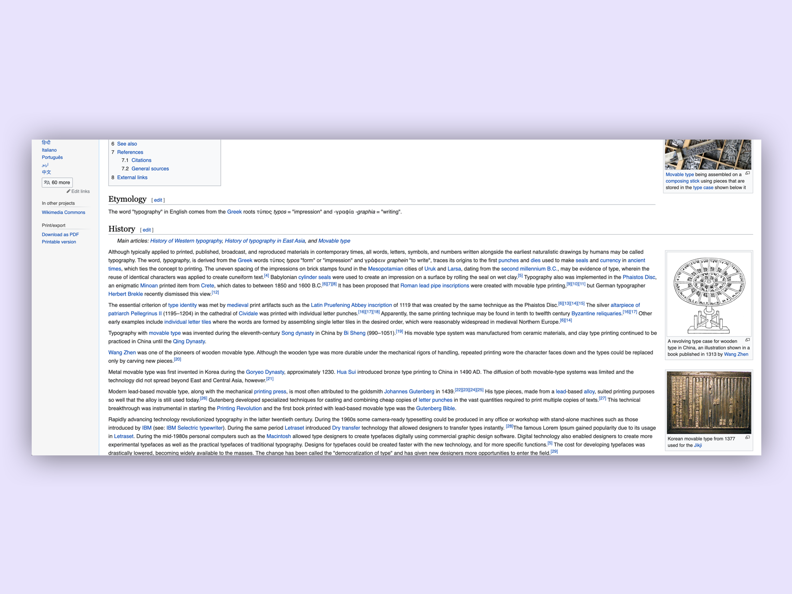 On wikipedia the line width is much too wide. It is often very uncomfortable for the reader to read this text.
In print, the rule is 60 – 80 characters per line. I personally like to have a value of 500 – 700 pixels for the text in width on a website. This is quite close to the rule for printing. The font size and font type also affects this value. In the end it is a combination of all values that leads to a harmonious and pleasantly readable typeface.
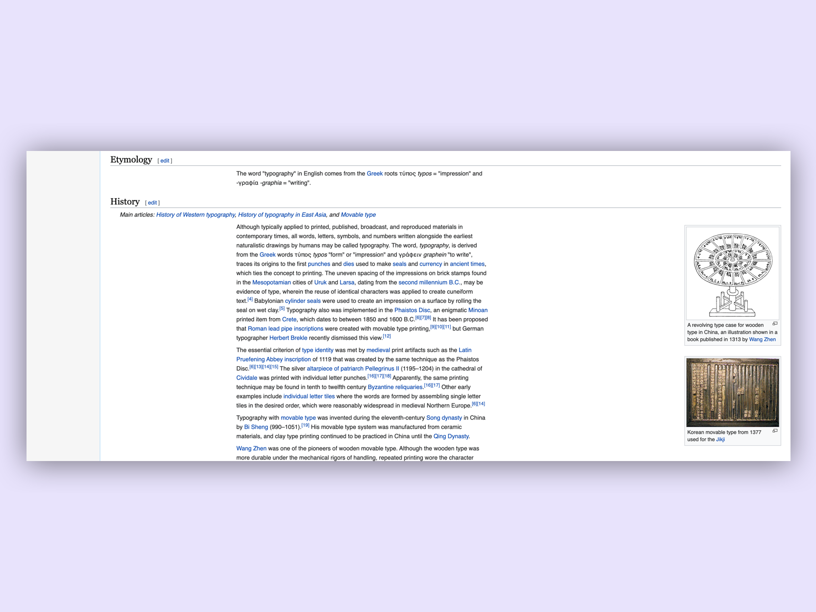 If the line width would be reduced to max. 600px as in this example, the readability would be massively improved.
| Device | Width |
|---|---|
| Desktop | 500 – 700px or 60 - 80 characters per line |
| Tablet | 500 – 700px or 60 – 80 characters per line |
| Mobile | full width |
Colors
According to the W3C guidelines, the contrast of text of normal size (approx. 13px - 17px) must have a contrast ratio of at least 4.5:1. From 18px and larger font sizes, the text must have a contrast ratio of at least 3:1.
| Font size | Contrast |
|---|---|
| 13 – 17px | 4.5:1 |
| 18px + | 3:1 |
There are countless tools for checking the contrast of elements and text, one of my favourite tools is the Colour Contrast Analyser from the paciello group.
Check colours to learn more about colours and contrast.
Levels of the titles
To give a page structure, it is important to have typographic levels. We distinguish two types of structuring. The visual structure and the technical structure.
Visual semantic structuring
In typography, text has always been structured by semantic design and optimized for the reader. As an example we can look at a text without any markup. We see in this case a simple block, without any differentiation in itself.
Quis eleifend quam adipiscing vitae. Cras sed felis eget velit. Magna ac placerat vestibulum lectus mauris ultrices eros in cursus. Montes nascetur ridiculus mus mauris vitae ultricies. Ac turpis egestas sed tempus urna et. Pellentesque sit amet porttitor eget dolor morbi non. Ipsum faucibus vitae aliquet nec.
By adding different sizes and markings in the weight of the font now the text is semantically structured. The appearance of the title also gives it the meaning of a title. The same applies to the basic text, which is recognized as basic text by its appearance.
Quis eleifend quam adipiscing vitae.
Cras sed felis eget velit. Magna ac placerat vestibulum lectus mauris ultrices eros in cursus. Montes nascetur ridiculus mus mauris vitae ultricies. Ac turpis egestas sed tempus urna et. Pellentesque sit amet porttitor eget dolor morbi non. Ipsum faucibus vitae aliquet nec.
To ensure that there is enough visual structure on a page, the typography must have gradations that are recognizable to the eye.
h1 Lorem ipsum
h2 Lorem ipsum
h3 Lorem ipsum
h4 Lorem ipsum
h5 Lorem ipsum
h6 Lorem ipsum
p Lorem ipsum
In this guide 6 gradations have been defined, which have a clear visual gradation for the eye and thus structure the page. It is important that there is a visual gradation, otherwise the page will be difficult for all users to understand.
Technical semantic structuring
Apart from the visual distinction, there is also a technical distinction. It is important that there is a descriptive h1 title at the top of the page. A h1 title should only appear once on a page and should never be used more than once. This is important for the ranking of the website and SEO, but also for people with disabilities who depend on a screen reader. Technically there should be a gradation from h2-h6. The screenreader doesn’t care if the gradation is visually correct, but we as designers do. In the best case the gradation is technically and visually the same.
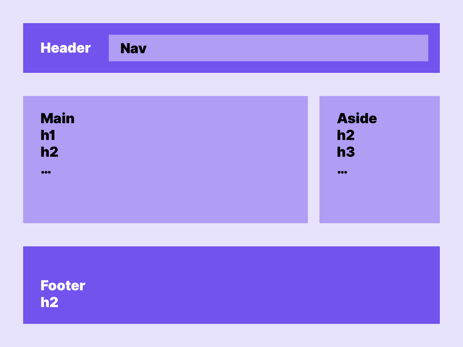 In this example we see how we label the main content with the h1 and then the usual gradations down to h6. While the other content starts with an h2-h6, since it is lower-level.
Check semantics and context to learn more about sematnics and how to structure a page.
Do not use text as image
Text that contributes to the content on the page and must be read should not be placed in images. A mortal sin in terms of accessibility. Screen readers have no chance of reading this text unless it is added with Alt text. However, I recommend not to do this.
Links
Toptal – Web typography
W3C – Page Titled
W3C – Section Headings