Nested content
Additional content is used when the user should not be confronted with the entire content immediately. On the one hand the user is not overwhelmed, on the other hand hiding content can cause problems.
Consistency and standards
Aesthetic and minimalist design

Table of contents
Why it is problematic to nest information
If content is nested by using tabs or accordions, the page appears more organized and structured. However, the complexity of the page and how to use it increases.
The following problems may occur:
- Users overlook content
- If unsuitable contents are nested, the usability for all users is reduced
- The demands on cross-device design are increasing
- For all users and special users with disabilities, the site becomes more complicated to use with screen reader and keyboard navigation
How to nest content correctly
In general, nested information is not bad, correctly implemented it can improve the usability of a page. An important part is the implementation of the elements in the code. For example the semantically correct implication: see chapter semantics. But also in the design there are certain rules that have to be observed.
Announce the content to be expected
If content is nested, it is important to provide it with a label that describes the content. This way the user knows exactly what to expect. See also chapter context for more informations about meaningful labels.
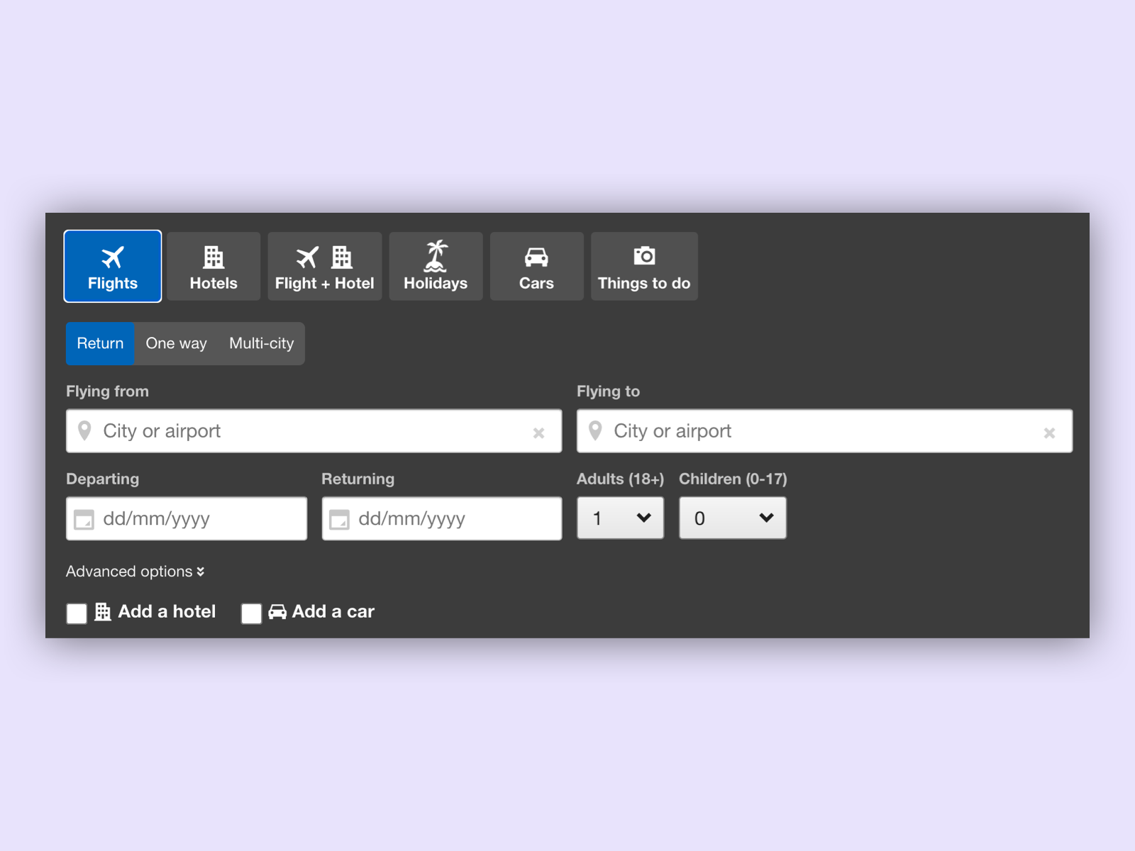 On the page of ebookers the labels are very clearly described and are supported by an icon. For the user it is immediately clear what to expect behind this tab.
Do not nest important functions
If content is nested, it should not be an essential part of the operation of the site. The operability of the site must not suffer. Otherwise it can be confusing for the users, because they cannot find important functions.
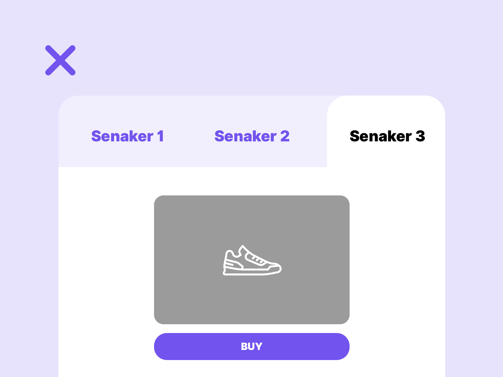
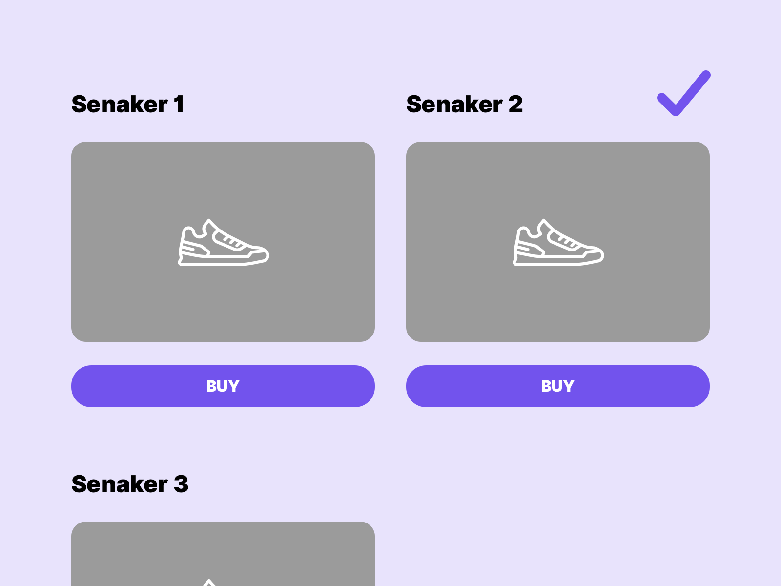
In this example the important buton within the tabs is overlooked. The interaction with the individual products is made more difficult by the unnecessary nesting. It is better to show the offers.
Display what is active
If information is nested, it is important to show the user which elements are currently active. Often a colourful highlighting is sufficient, optimnally this is supported by backgrounds. This allows the user to set the content in context more easily. See also chapter context.
the following example shows the problem
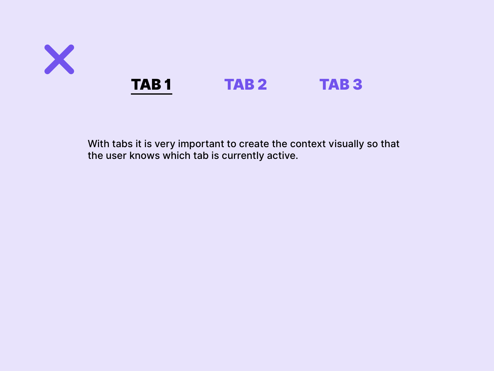
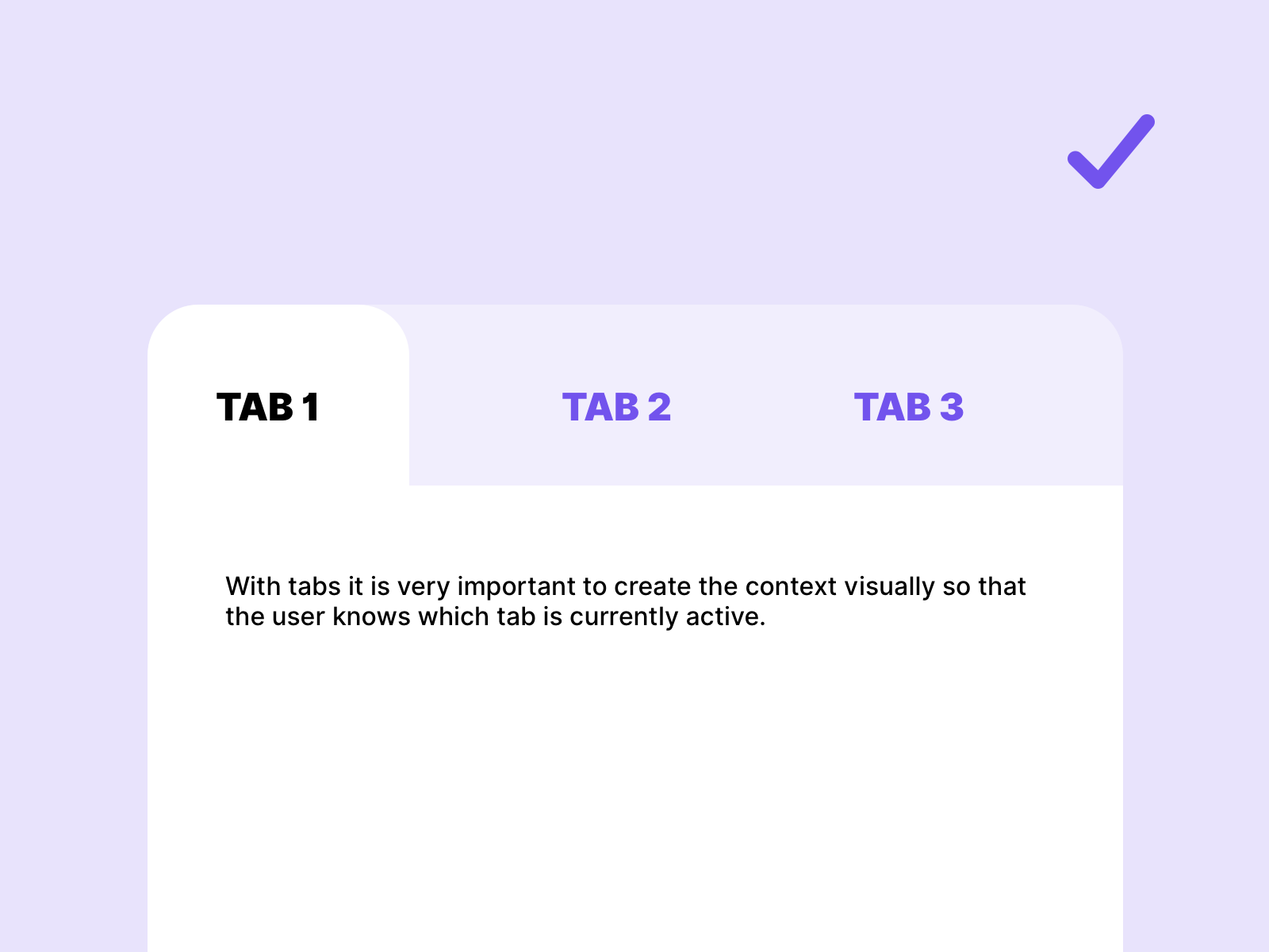
In the first example it can be difficult for some users to see the active state of the tabs. In the second example, where the background is used to connect to the content, it is clear which tab is active.
Links
W3C – Accordion
W3C – Example Disclosure (Show/Hide)