Colours
When it comes to colors, many brands prescribe a color palette based on the existing ci. However, if the colours are not optimised for the web, there is a risk of accessibility problems.

Table of contents
- It affects more people than you think
- Give your site enough contrast
- Do not make information dependent on their colour
- Determine the primary and secondary colours
- How to create a barrier-free colour scheme?
- But what if the customer specifies the colours?
It affects more people than you think
According to WHO in 2020 there are 2.2 billion people with impaired vision. Of these, 300 million people are affected by colour blindness in various forms. And for this reason, designers should definitely think about colors and contrasts. With little effort, the accessibility of a page can be massively improved.
Colors that do not comply with an accessible standard may be a problem for following users:
- People who suffer from a form of colour blindness
- People with impaired vision
- Not enough contrast affects all users
Give your site enough contrast
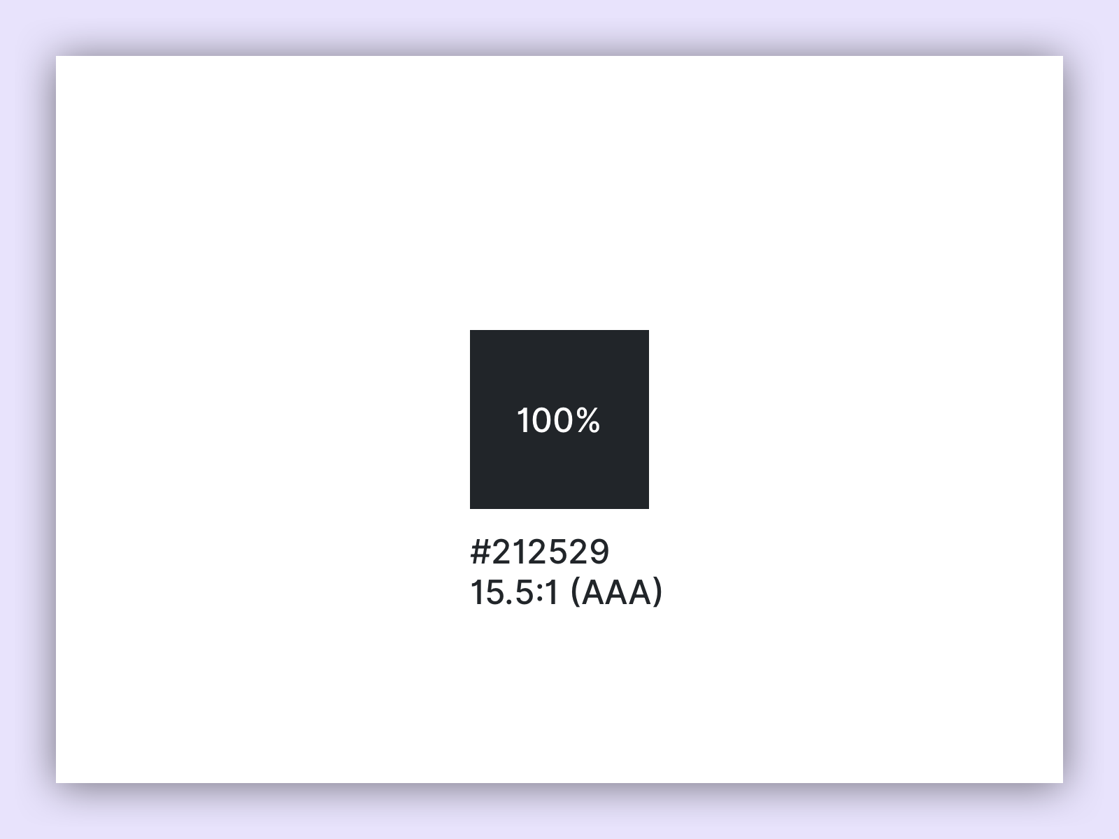
According to W3C guidelines, the contrast of small text size must have a contrast ratio of at least 4.5:1. From 24px and larger font sizes the text must have a contrast ratio of at least 3:1. Graphic objects and UI components should generally have a contrast ratio of 3:1.
| Level AA minimum contrast | Level AAA minumum contrast |
|---|---|
| small text (16px, 4.5:1) | small text (16px, 7:1) |
| large text (24px – 3:1) | large text (24px – 4.5:1) |
There are countless tools for checking the contrast of elements and text, one of my favourite tools is the Colour Contrast Analyser from the paciello group.
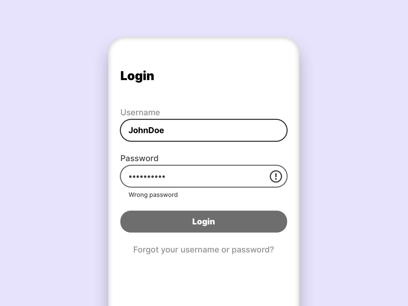
The following example shows what effect a carefully chosen contrast has on the page:
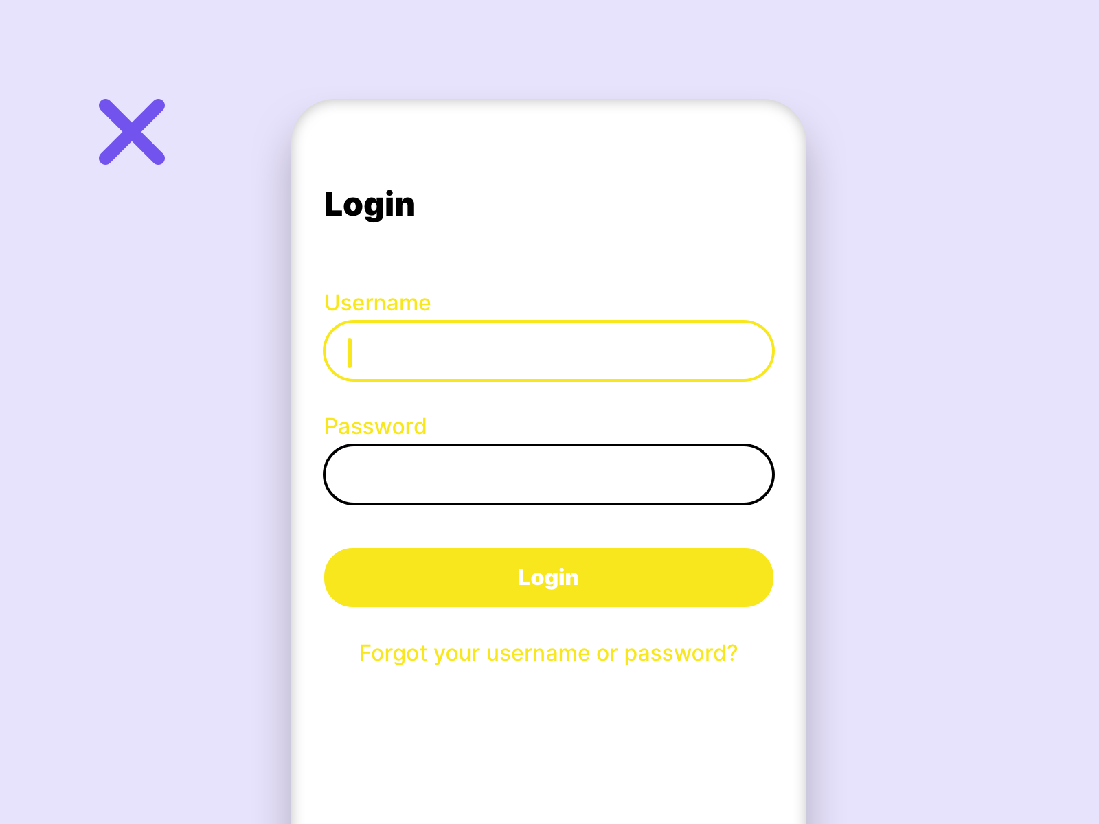
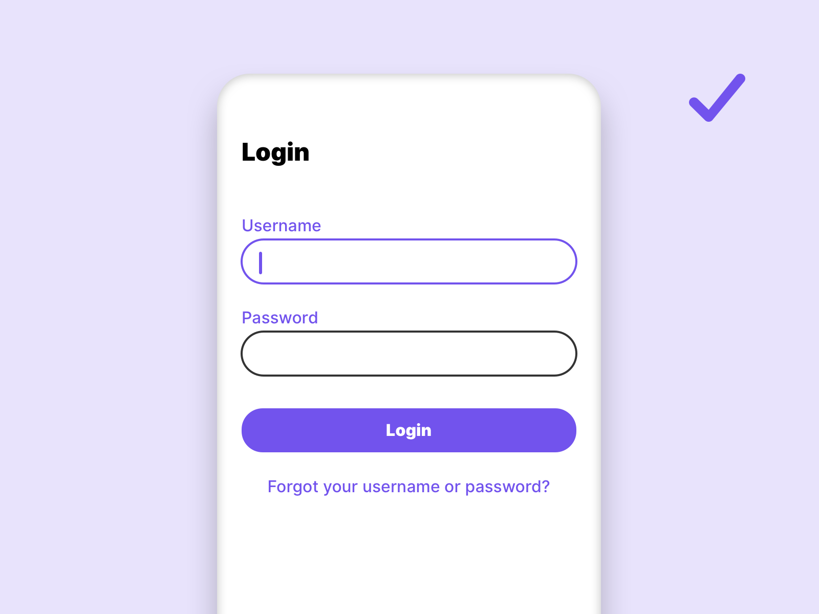
On the left side, the User Interface (UI) does not conform to any Web Content Accessibility Guidelines (WCAG) standard, while on the right side it conforms to the WCAG AA standard.
Do not make information dependent on their colour
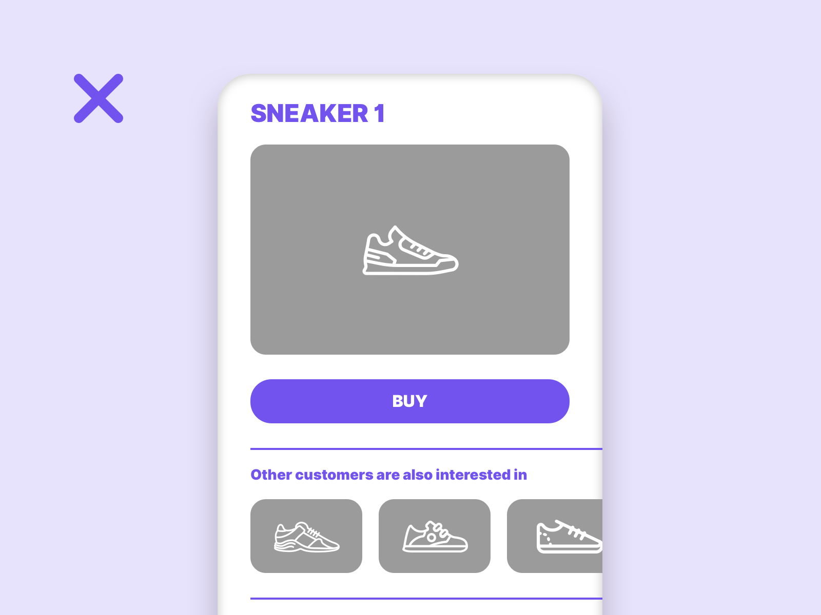
To ensure that visually impaired users can see all information on a page, it is important not to make the information dependent on a colour.
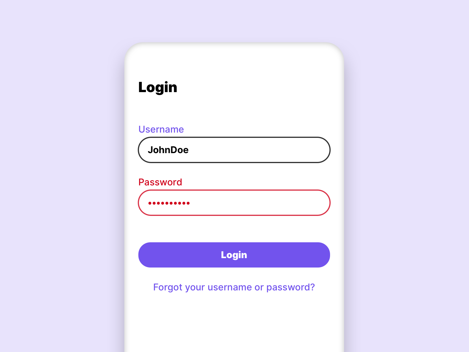
In this example we see that users suffering from total color blindness cannot see the input error.
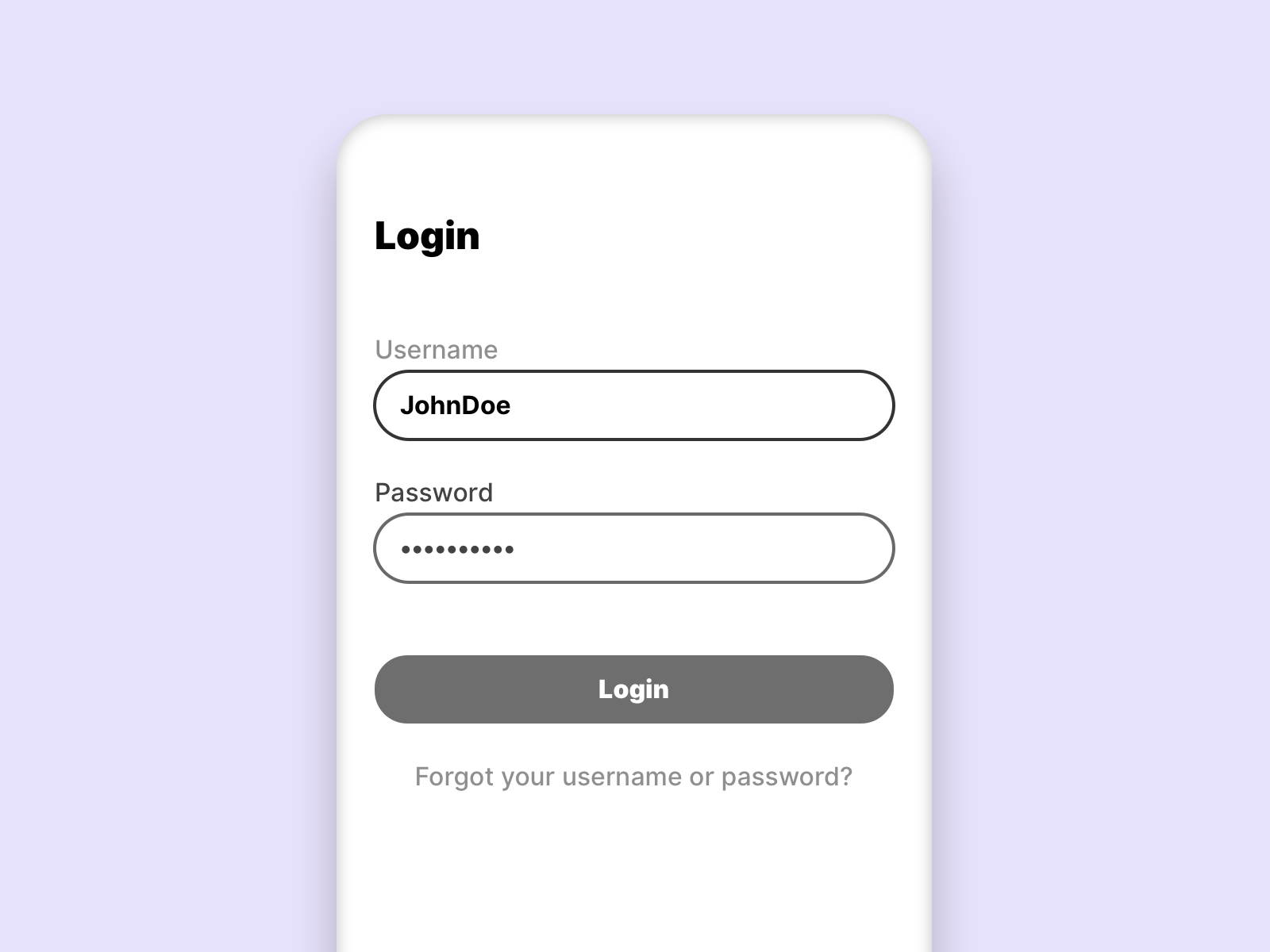
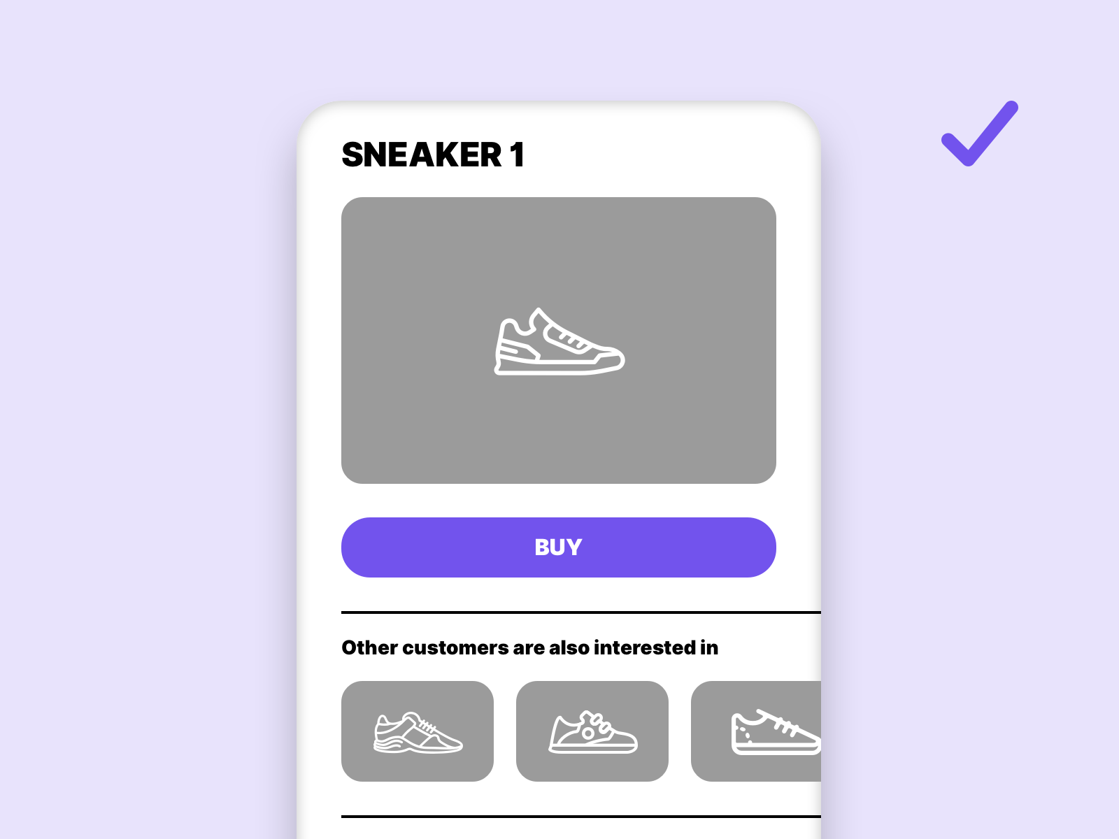
To make the error message accessible to all people, we have to add icons and explanatory text.
 Now even a person who suffers from total color blindness can see the error message.
Determine the primary and secondary colours
Colours are an important design tool when it comes to the usability of a page. We can use colours to highlight interactive elements, brand the website or highlight information. It makes sense to use a strict colour system. Generally we can separate the page into 2 colour systems.
Primary colours
Primary colours are essential colours in our design system. This includes colours like: Text colour, interaction colour, white and branding colour. These colours are exclusive and are only used for the intended purpose. They allow users with impaired vision to better navigate.
Secondary colours
Secondary colours are used to design the page, for example within illustrations or graphics. But backgrounds can also be defined in this colour category. In general, it should be noted that these differ enough from the primary colours. And that they have enough contrast.
This example shows why it makes sense to define a interaction color for clickable elements. The actual main interaction is lost if the interaction color is used too often.
How to create a barrier-free colour scheme?
Now that we know the basic rules, it is time to apply them in practice. Not so many steps are necessary to create a barrier-free colour scheme.
Define the shades of gray
Grey tones are essential in almost every system. They are used for backgrounds or fonts. 3 different grey tones form a good basis for a colour system.
Define the font color
The font colour is usually the darkest shade of grey that we use. It must have a contrast of at least 7:1 or more.
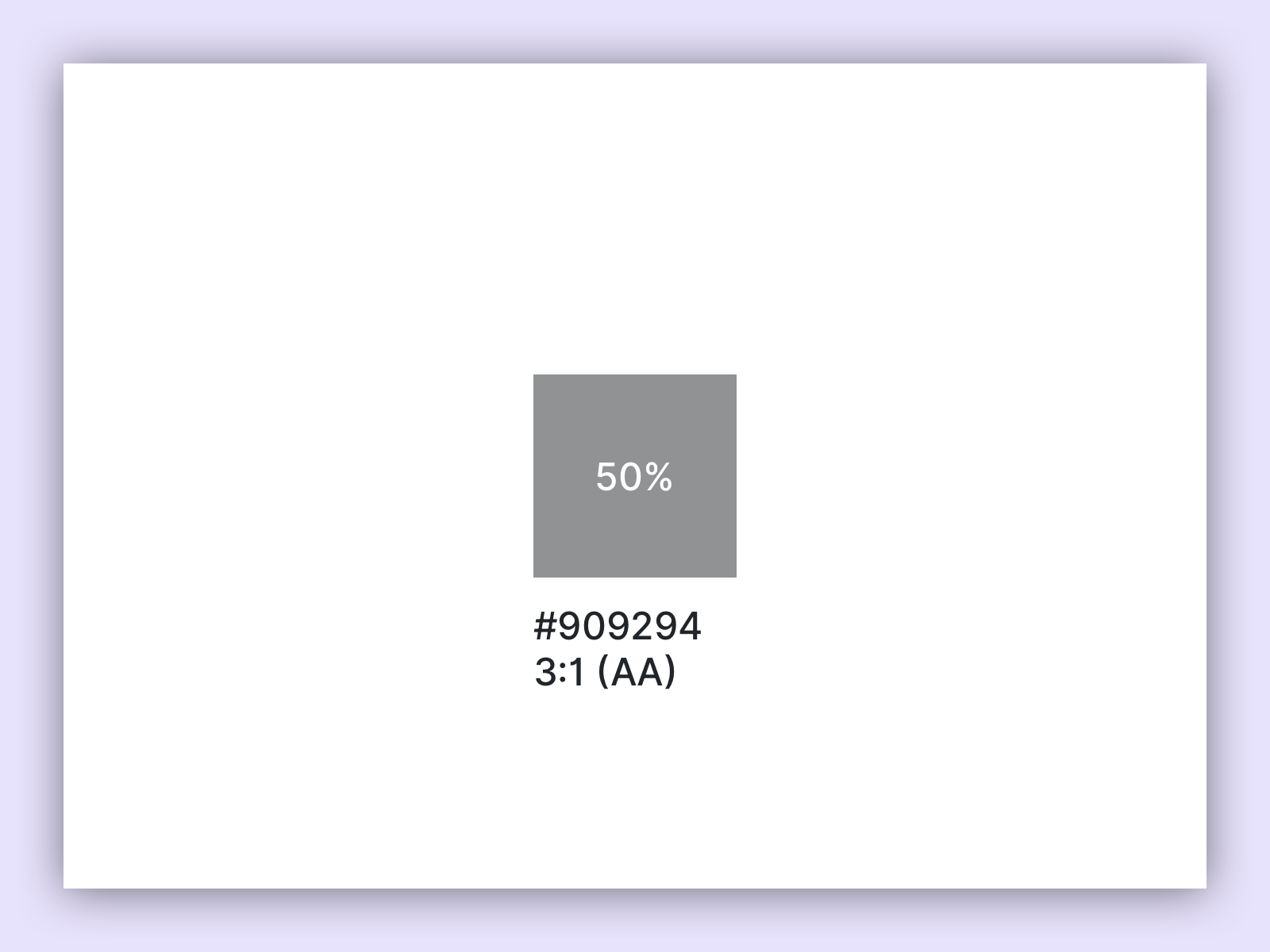
Define the brightest grey tone
Once the font color is selected, we define the brightest possible tone for the gray we want to use as the font. This color must not be less than the contrast value of 3:1.
Find the middle
After the darkest and lightest color value for text, we look for an average value with a contrast ratio of 4.5:1.
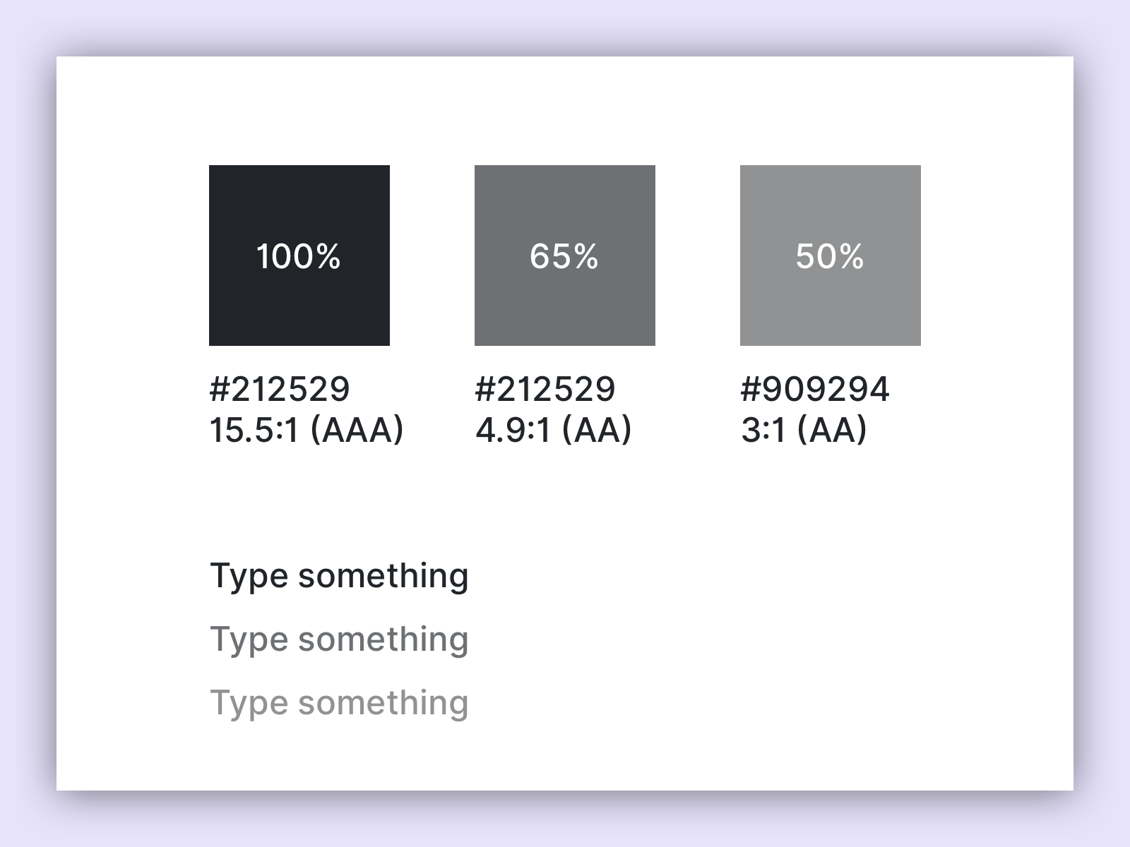
Now we have defined 3 colors in our color system which are accessible for the text. This gives us the possibility to mark a primary, secondary and tertiary text.
Define a background
Now we need a background, we have white, because we know that this color works for all 3 colors. But we need a grey background in the colour scheme. For example to separate certain sections.
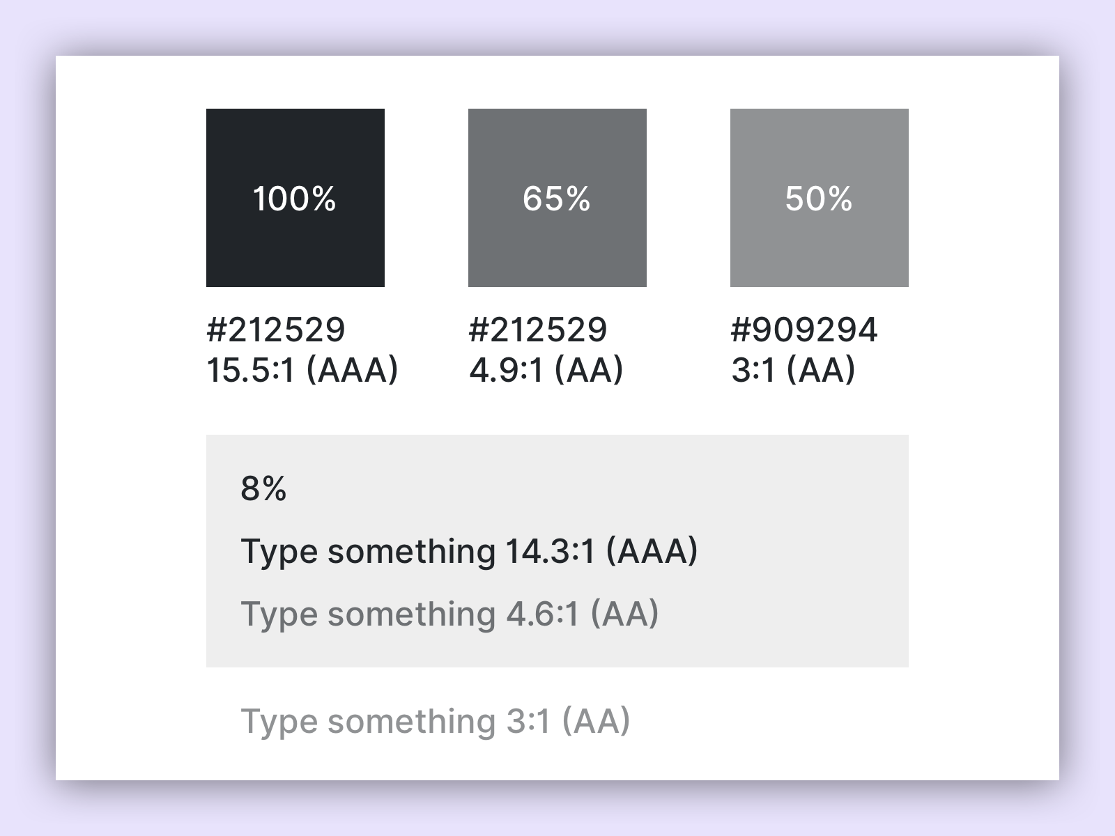
We only use tertiary text on a white background, which means we have to make sure that we get enough contrast to our background for the primary and secondary text. The contrast value of 4.5:1 is the minimum contrast.
Define the colors
With colours, the whole thing becomes a bit more complex, we can’t just change the opacity, we have to find and match certain colour values. That’s a process that can take some time, but it’s worth it. First we define the main color and make sure that there is enough contrast. It is useful to define an additional background, making sure that it has enough contrast to the black primary text and our defined color.
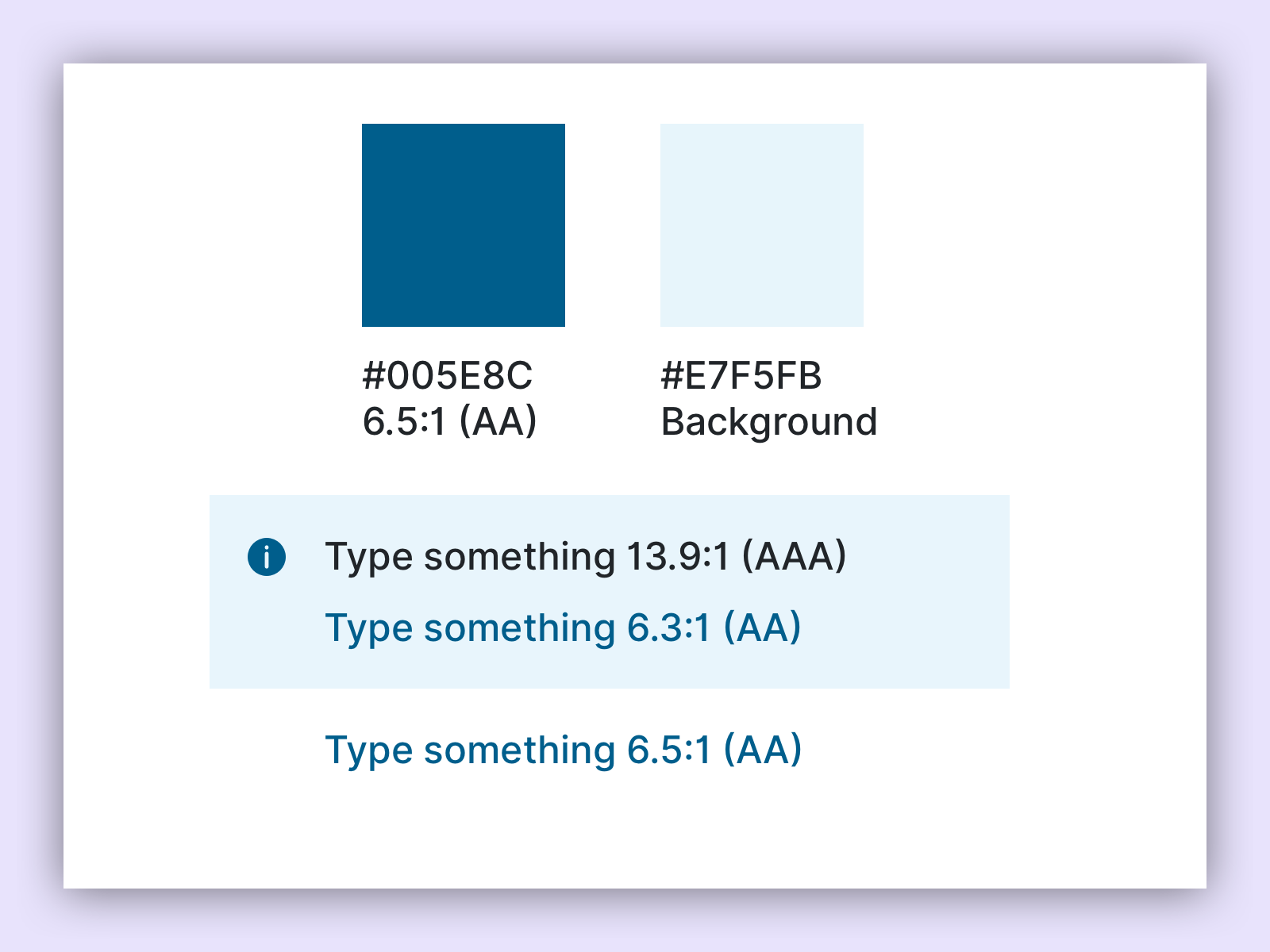
Once we have defined a color, an accent color and a background, we can repeat this process for each additional color.
But what if the customer specifies the colours?
Make it clear to your customer that in this case his specified colours cannot be transferred 1:1 to the web. Not enough contrast on the website has a negative effect on all users.
Links
W3C – Contrast minimum
W3C – Contrast enhanced
W3C – Non text contrast
W3C – Use of color