Consistency
A consistent design that is used throughout the system gives the user a feeling of confidence when working with the system. But what exactly does this mean and what do I need to consider?
Consistency and standards
Aesthetic and minimalist design

Table of contents
- The problem with inconsistent use of elements
- Same appearance same function
- Colours
- Positionings
- How can I achieve a consistent design?
The problem with inconsistent use of elements
Elements with the same appearance should always have the same function. This is important for users who are not familiar with the system or for people with disabilities.
An inconsistent system can be a problem for the following users
- People who are blind and navigate with a screen reader
- User with impaired vision
- Inexperienced or older users
Same appearance same function
If 2 elements look the same, but trigger a different action, this leads to confusion for the user. The site may become unusable for people with disabilities.
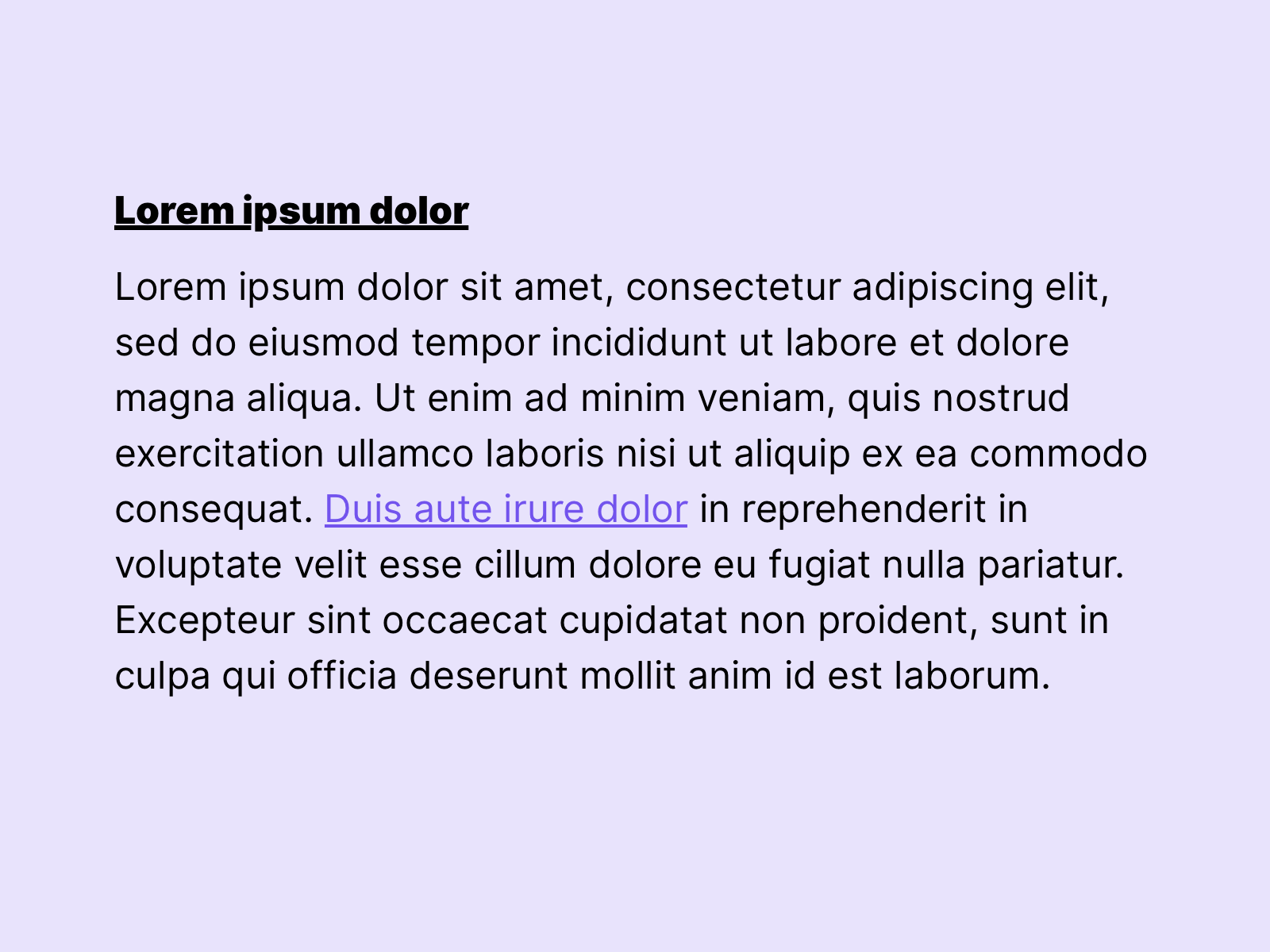 In this example titles are underlined, this can lead to confusion, because links in the copy text are also underlined. This can lead to problems despite colour differentiation.
Colours
Colours are an important design tool when it comes to the usability of a page. We can use colours to highlight interactive elements, brand the website or highlight information. It makes sense to use a strict colour system. Generally we can separate the page into 2 colour systems. See also chapter colours to get more detailed informations about colours.
Primary colours
Primary colours are essential colours in our design system. This includes colours like: Text colour, interaction colour, white and branding colour. These colours are exclusive and are only used for the intended purpose. They allow users with impaired vision to better navigate.
Secondary colours
Secondary colours are used to design the page, for example within illustrations or graphics. But backgrounds can also be defined in this colour category. In general, it should be noted that these differ enough from the primary colours. And that they have enough contrast.
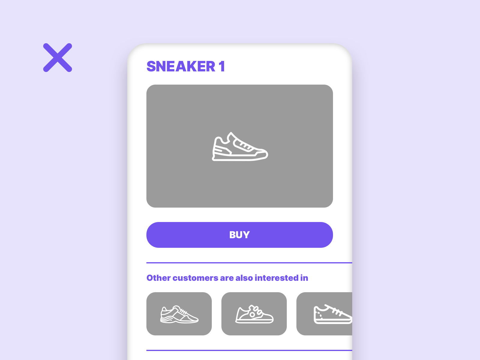
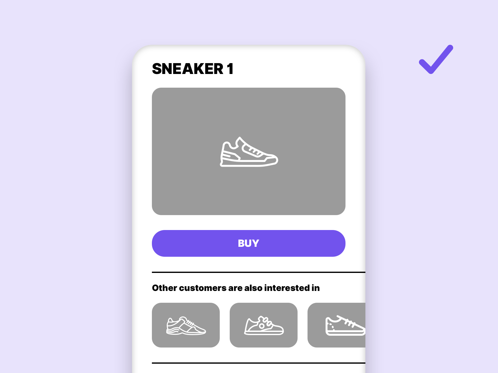
This example shows why it makes sense to define a color for clickable elements. The actual main interaction is lost if the interaction color is used too often.
Positionings
Certain elements have established their position on a website and should be retained. These include navigation and footer. As a general rule, it should be ensured that elements once placed are consistently placed in the same position on all other pages. This allows users with screen readers or users with disabilities to use familiar patterns.
How can I achieve a consistent design?
A consistent design across all breakpoints and screens can only be achieved with a detailed design system. Even if You as ux-designer not work with other designers, it makes sense to create one. You can work on a solid basis during the whole design process.

Links
W3C – Consistent Navigation
W3C – Use of Color
W3C – Contrast