Keyboard friendly
We usually use the mouse or trackpad to navigate around a website. But not all users can use a website in the way we as designers often imagine.
Consistency and standards
Flexibility and efficiency of use

Table of contents
Why it is important
Users with disabilities often use the keyboard to navigate a page. In general, a Web site should be fully accessible using the keyboard. In most cases, it is the job of developers or designers with code knowledge to ensure this. However, some considerations can be made in the design phase without code to improve keyboard accessibility and help developers optimize content for keyboard use.
For the following people, a Web site that is not accessible using the keyboard can be a problem:
- People who are blind and navigate with a screen reader
- Users who are dependent on keyboard navigation
- People with temporary impairments, for example injured hands
- Old people who navigate using the keyboard
Structure of the Page
As we have discussed in the chapter semantics, the semantic of a website, means structuring the elements on a site into clear groups based on their meaning. This can greatly improve the ease of use of the keyboard.
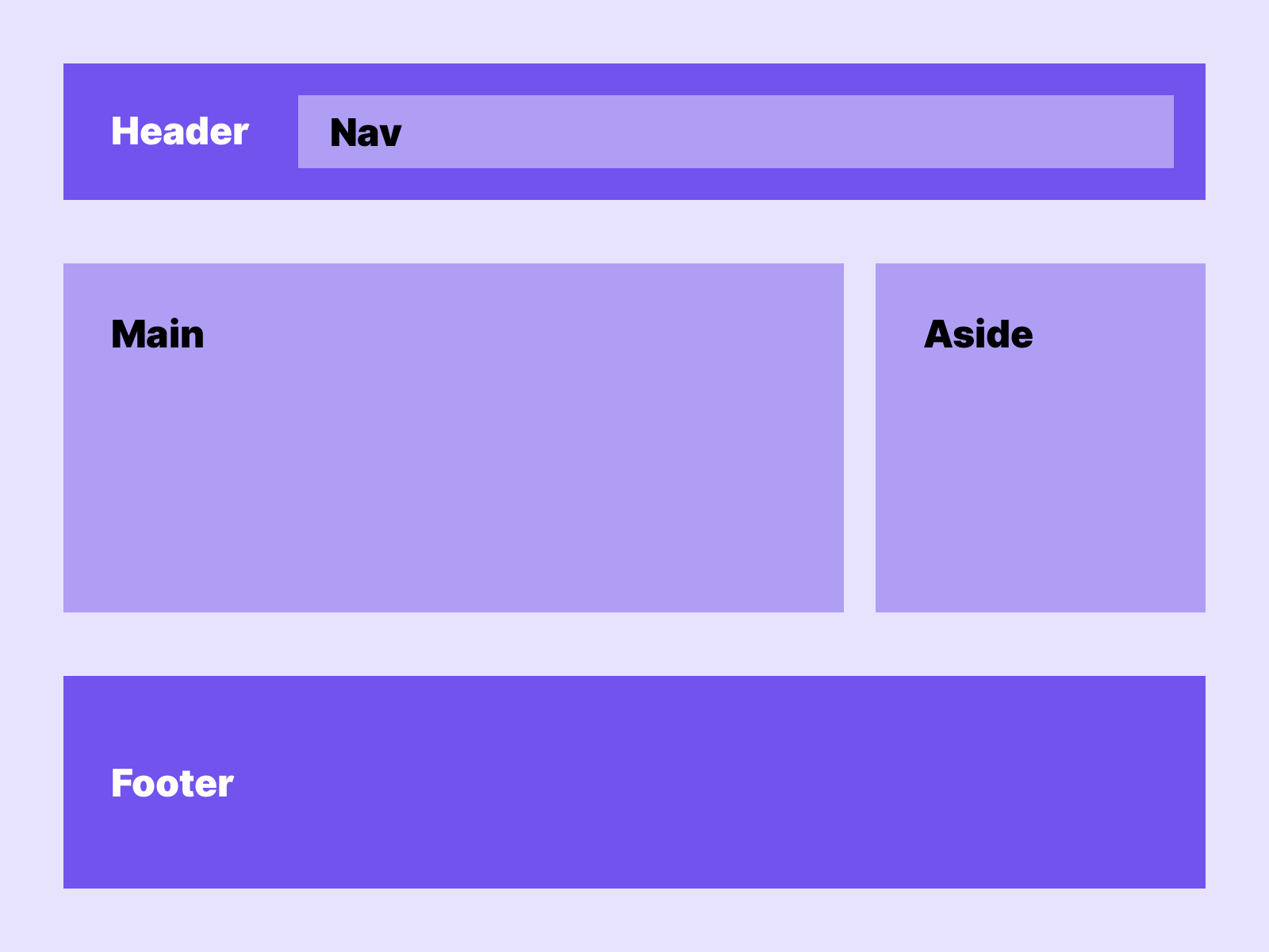 In this example clear structures can be seen on the page. If modules are designed within this structure, implementation in the code is easier later.
A clear separation of the page into its semantic components makes it easier for the user to navigate with the keyboard. The user can jump from section to section and from element to element. As a designer, it makes sense to design in individual semantic elements from the very beginning, so that clear groups of elements are later developed on the page.
Focus indicators
The focus indicator of a website is a useful tool to improve the usability of the website using the keyboard. But let’s be honest, the default focus indicators in the browser are not that great. One of the most common problems is that they do not fit into the design. Instead of removing the indicators now, they should be actively designed and planned from the beginning. After all, there are ways of designing them that are unfortunately often forgotten by designers.
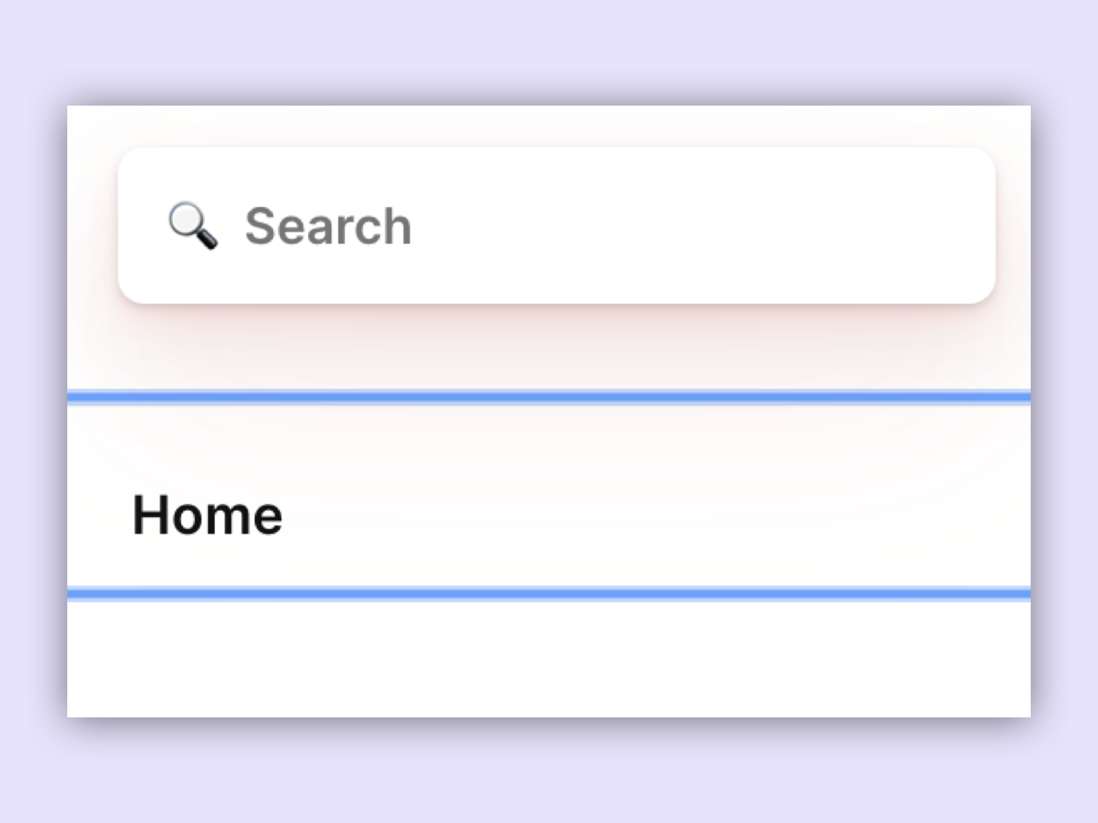 Default focus indicator in Chrome.
When it comes to designing focus indicators, the following should be considered:
- The size and shape of the indicator should stand out from the current element
- The focus indicator should stand out from the hover and active status of the items
- The indicator should have enough contrast
- The colour of the indicator should fit into the design, but stand out clearly enough.
- Make sure that the indicator looks the same on all browsers
- Be sure that the indicator can be applied to all elements
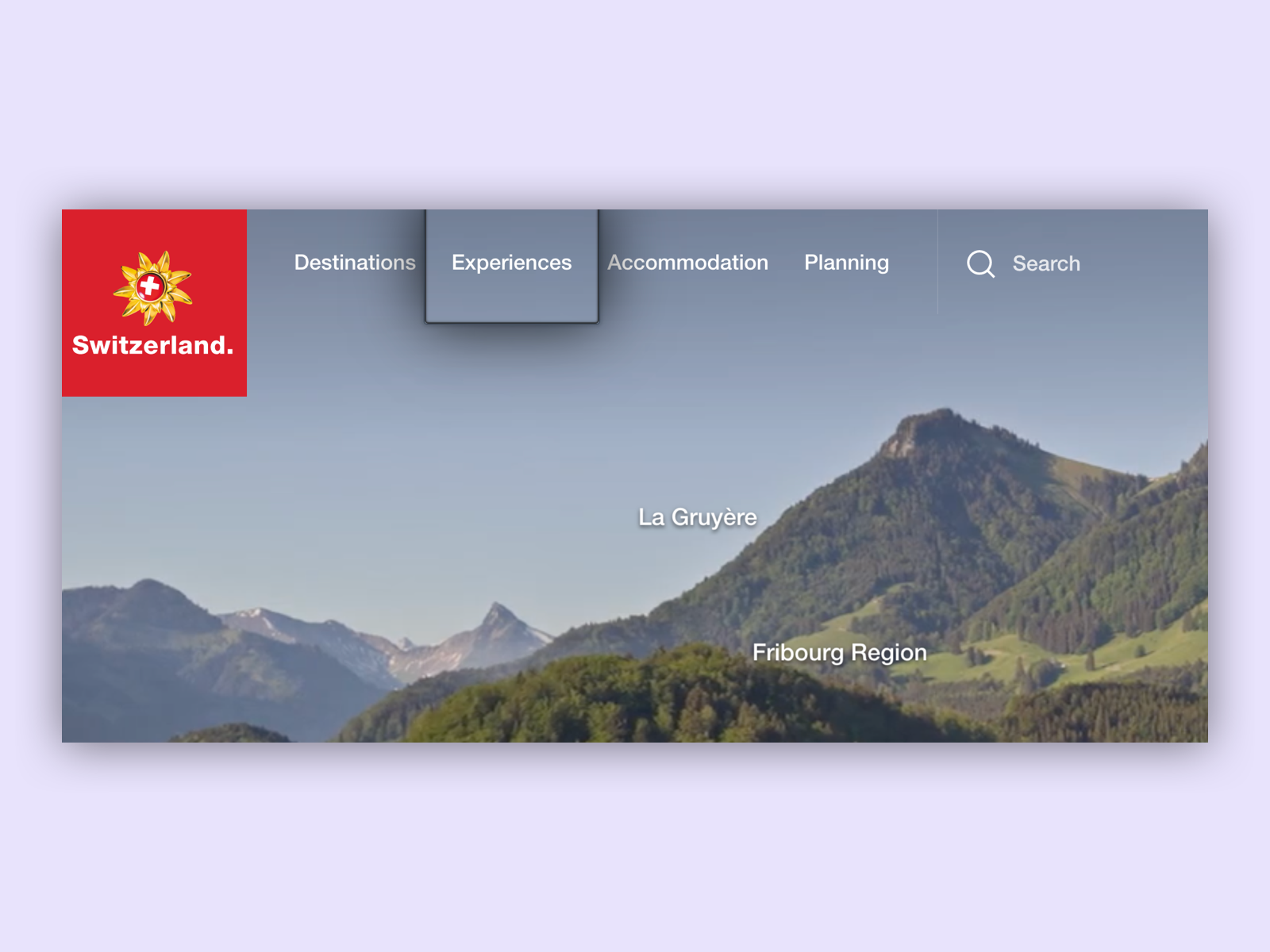 On the myswitzerland website, the focus is elegantly integrated into the design. An outline and a drop shadow serve as indicators here. This creates the impression that the focus surrounds an invisible button.
Skip buttons and hidden keyboard features
A very important feature when operating websites through the keyboard are hidden keyboard features. These are navigation points which can only be reached by using the keyboard, for example we can have a closer look at the google search. After a search, we can enter the separate keyboard menu by using the tab key. This way keyboard users can skip links in the header and immediately go to the main content, this is a so-called skip button.
In this example of Google search we see a button to skip after the result appears when we use keyboard navigation.
Good to know
This means that we have to plan additional space in the navigation to fit a keyboard navigation.
Do not use too many link sections
People with visual or physical disabilities navigate through a website using a screen reader or keyboard, and if teasers and links are repeatedly inserted into relevant content, the user experience can be severely impaired. This is because users with screenreaders or keyboard navigation can later ignore irrelevant content as users can without impairment. It is better to insert such sections at the bottom of a page so that users with screen readers can also ignore them.
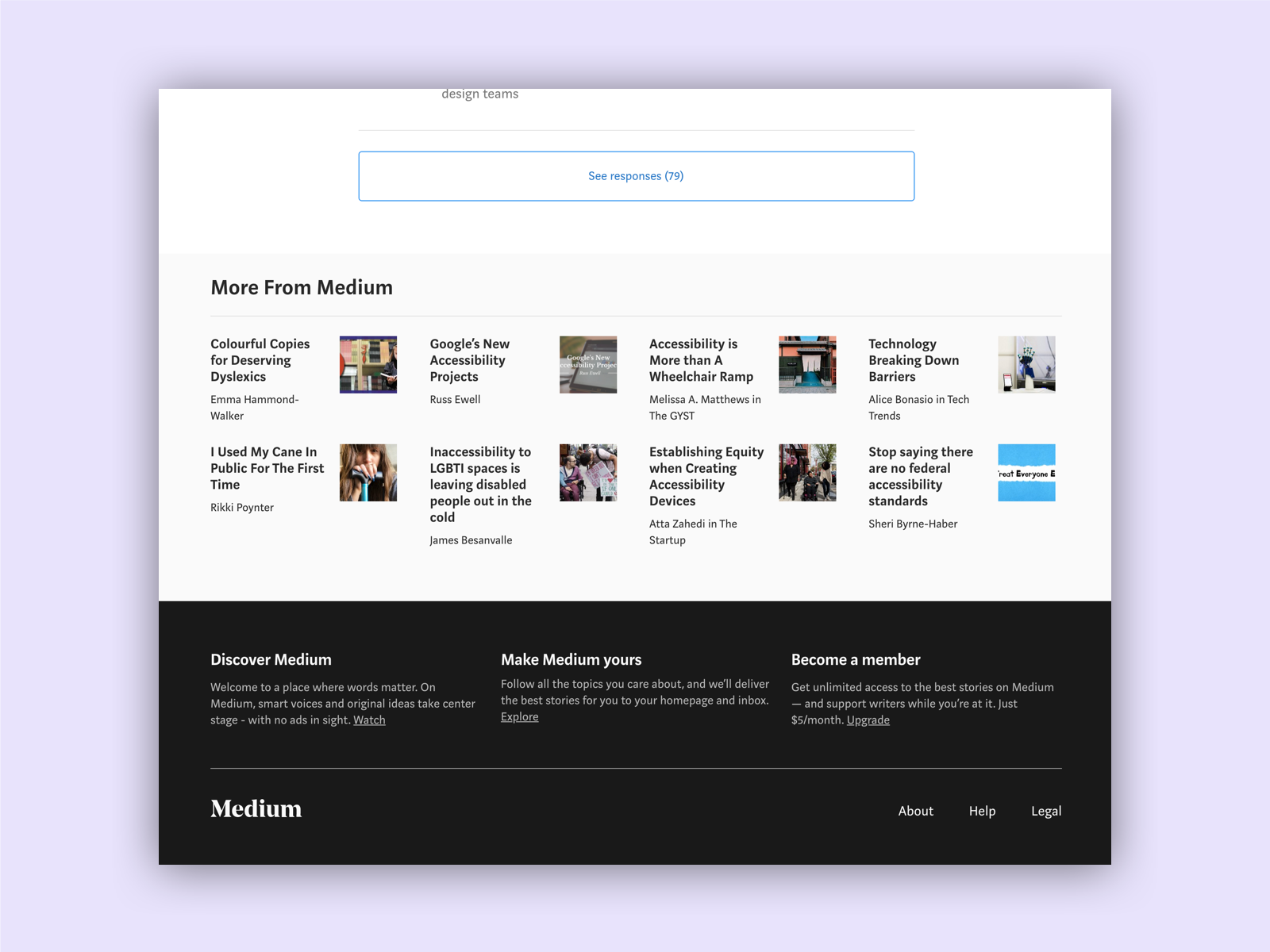 A good example of this are pages on which articles are read. As a user of a screen reader, I do not want to be taken out of context by the article because related articles are suggested to me. Therefore, it makes sense for all users to place them at the end of the article. medium
Links
W3C – Keyboard Accessible
W3C – Focus Visible
W3C – Bypass Blocks