10 Heuristics of Jakob Nielsen
If there is such a thing as a generally accepted guide to good usability, then these are the 10 interaction design principles of Jakob Nielsen. If the heuristics are followed from the beginning, many accessibility problems can be avoided.

Table of contents
- 1. Visibility of system status
- 2. Match between system and the real world
- 3. User control and freedom
- 4. Consistency and standards
- 5. Error prevention
- 6. Recognition rather than recall
- 7. Flexibility and efficiency of use
- 8. Aesthetic and minimalist design
- 9. Help users recognize, diagnose, and recover from errors
- 10. Help and documentation
1. Visibility of system status
Nothing is more annoying than a process that the user cannot understand. The system should always give the user feedback in a reasonable amount of time and inform him about what is happening. By providing clear feedback on the status of the system, people with disabilities will feel more secure while using the system.
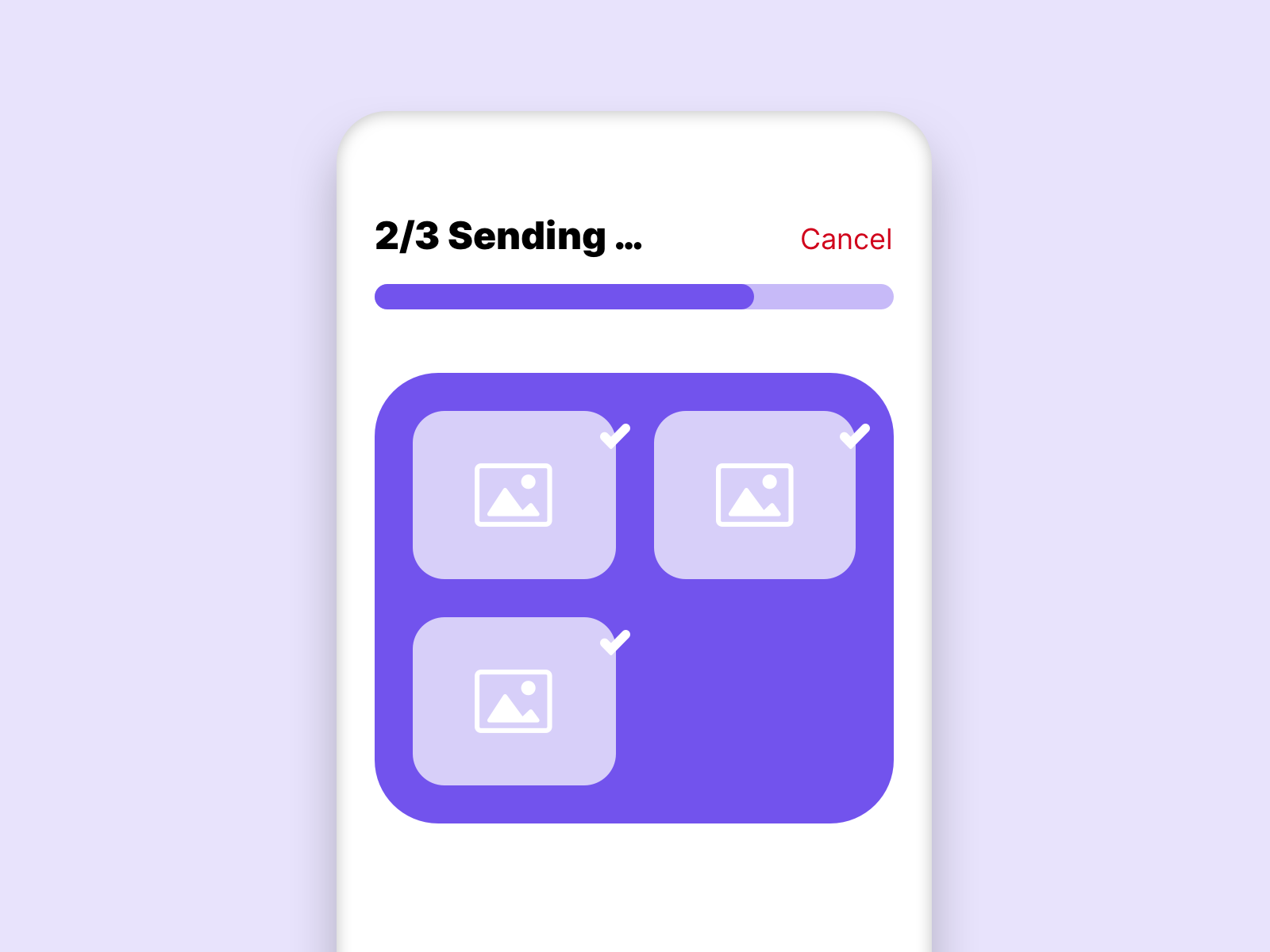
In this example the user is immediately shown that the sending is in progress. Also the progress of the process is shown to the user. Through this feedback the user knows that everything works.
2. Match between system and the real world
In order for the interface to speak the language of the user, it is important to use familiar patterns. Shapes from the real world which can be transferred into the digital interface can increase the usability significantly.
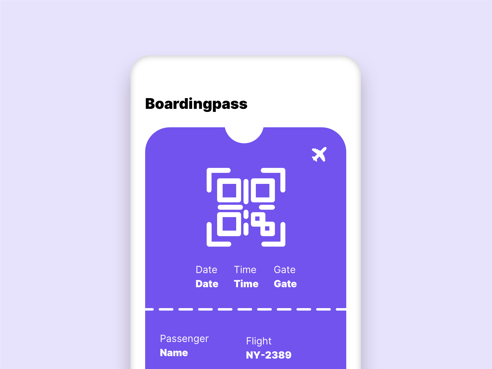
In this example we see a boarding pass, it makes sense that we do not change its appearance. The user knows where to find his information on a printed boarding pass. Another example are credit cards in apps.
3. User control and freedom
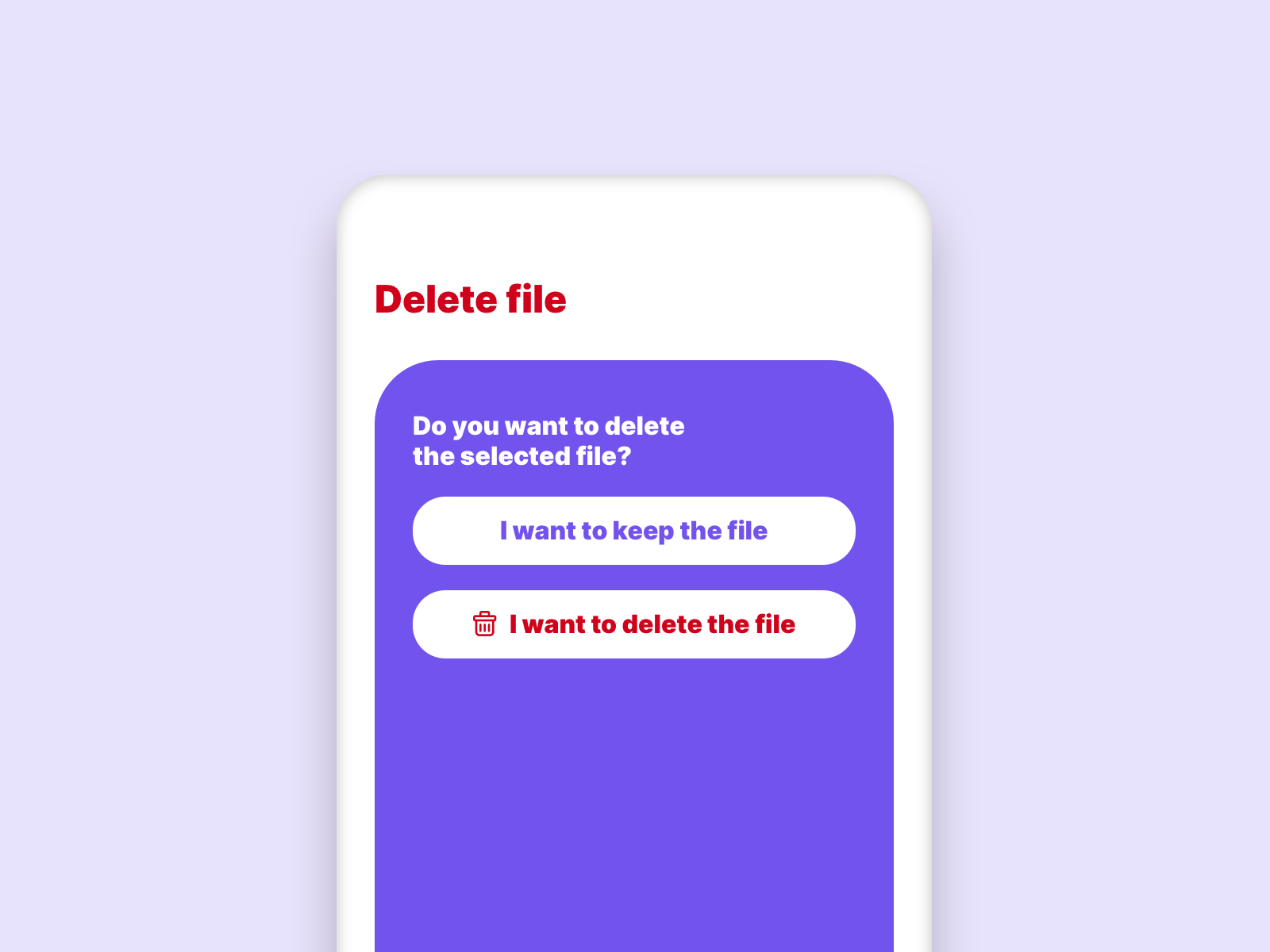
Incorrect functions of a system are quickly selected, we should always and at any time give the user the opportunity to abort a process as easy as possible. This can especially help people with disabilities if they accidentally activate a wrong function in the system.
4. Consistency and standards
A very important point to improve the accessibility of a site. Same appearance and same wording should always mean the same function.
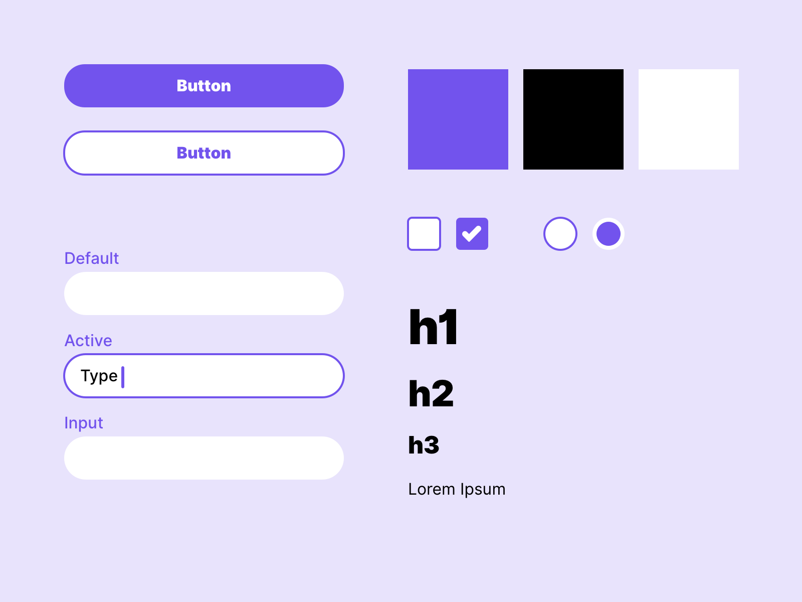
To ensure consistency across the entire project, you should always create a design system. This makes it easier to use the same elements across all screens.
5. Error prevention
Through the appearance of the elements and their positioning, errors can be avoided right from the start. This can reduce the error rate when using the system and at the same time increase accessibility.
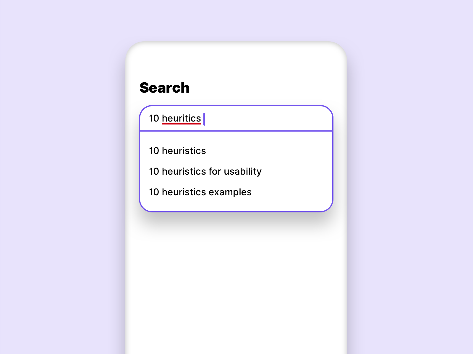
In this example, the user is shown suggestions while typing, even though he has misspelled the term. This avoids an unnecessary search without result.
6. Recognition rather than recall
The user should never have to remember relevant information across multiple interactions. The design should always demand as little background knowledge from the user as possible. Options and actions should always be visible. The system should support the user, so the accessibility of a page can be increased.
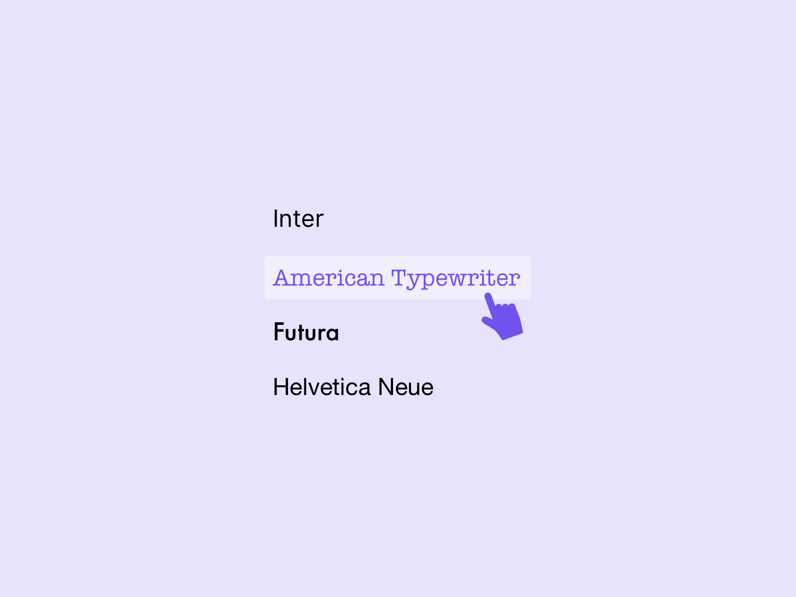
A good example is a font selection menu. No one can ask the user to know the visuality of all fonts by memory. Therefore their visuality is already shown in the menu.
7. Flexibility and efficiency of use
The system should be customizable for experienced users. So they can use tools and shortcuts to work with the system faster and easier. For inexperienced users or people with disabilities, the lack of use of such tools should not affect the process.
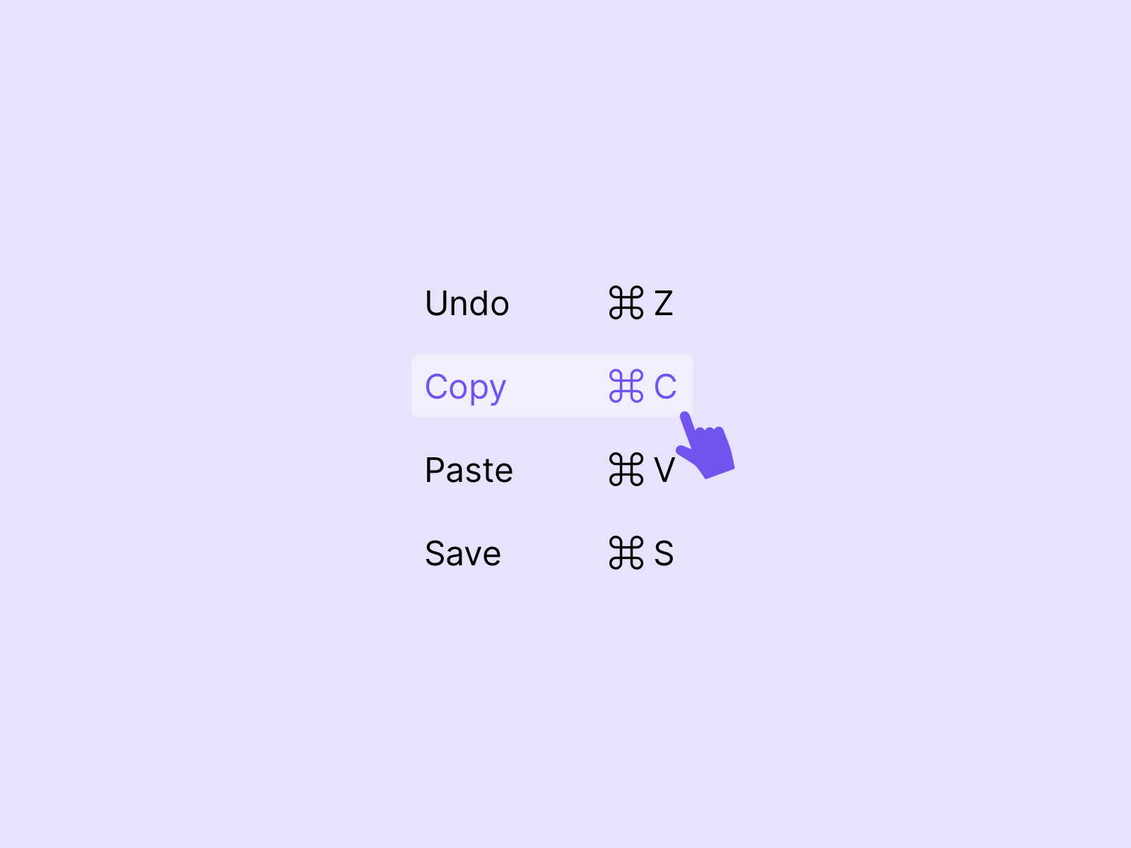
In this example the common shortcuts of programs are shown, these can be used via the keyboard or via the navigation.
8. Aesthetic and minimalist design
Dialogues should be reduced to the essential. The user should only be shown what is relevant for him. This increases the usability of a page by a screen reader significantly.
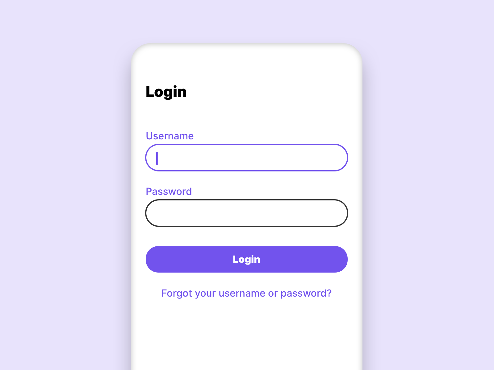
As a good example of this, login screens can be considered. There is nothing else on such a screen but elements that are needed for the login. Also search engines are a good example, google reduces its home page to the essential. Nothing more than a search box is needed.
9. Help users recognize, diagnose, and recover from errors
Error messages should be described as simply as possible and should not contain any code. Suggested solutions help the users to solve the problem.
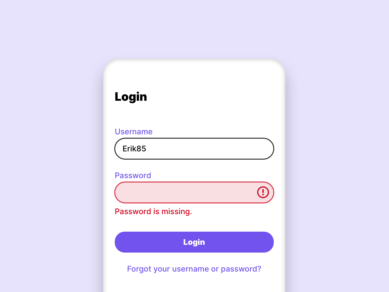
By marking the incorrect input field and the clear message that describes the error, the user knows exactly what to do.
10. Help and documentation
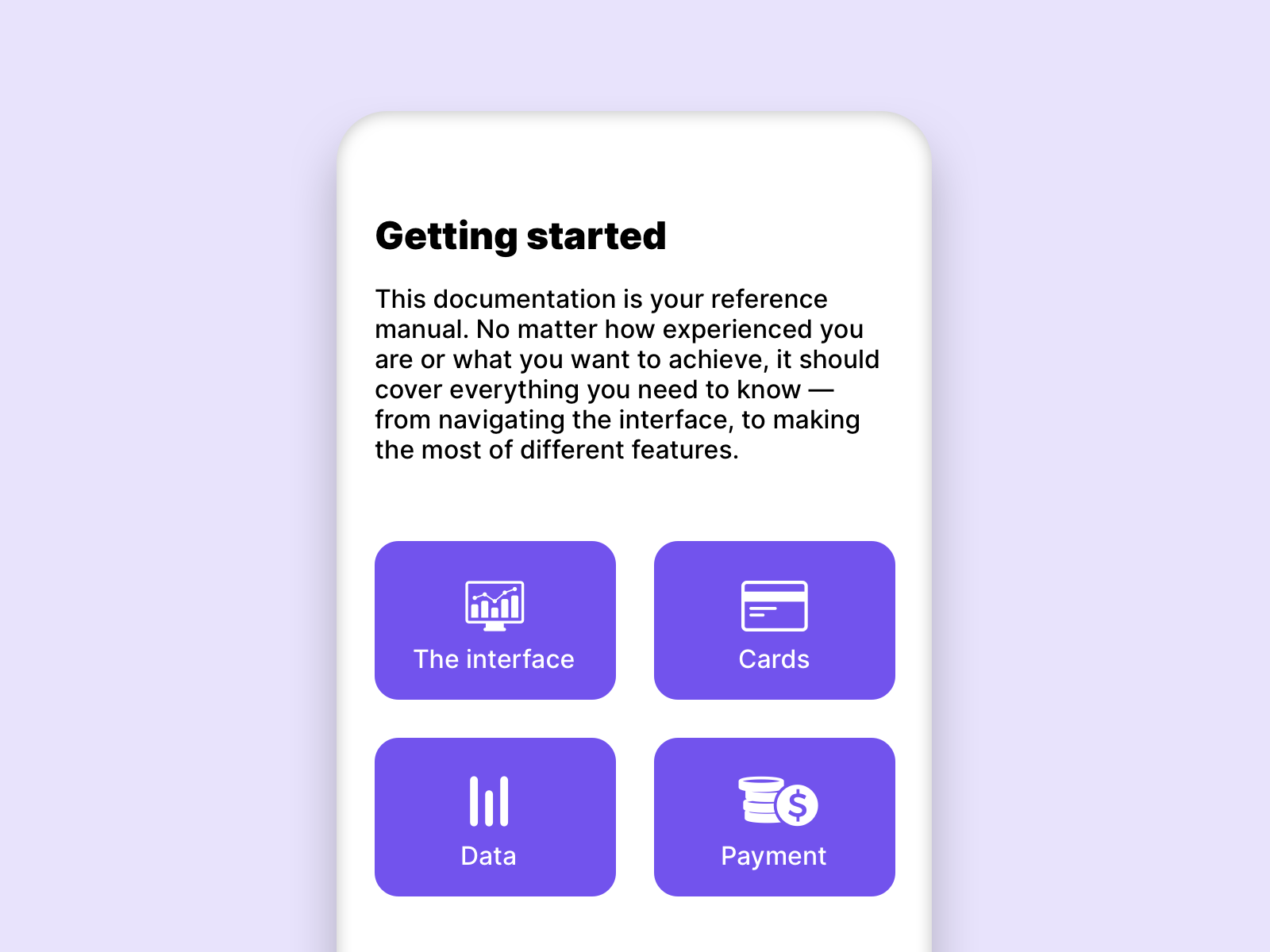
Even if a system should be self-explanatory, it is helpful to have a simple and quick guide.
Links
Nielsen Norman Group – 10 Heuristics