Navigation
The navigation is the heart of many websites and apps. If mistakes are made there, the user experience is significantly affected. But this does not have to be the case.
Consistency and standards
User control and freedom
Aesthetic and minimalist design

Table of contents
Why it is important
If certain rules in a navigation are not followed, users can lose their orientation within the page. Content may be overlooked or not found, and there may also be a feeling that your target group is not being addressed.
An inconsistent and not well thought out navigation can be a problem for the following users:
- People with a visual impairment
- People who are blind and navigate with a screen reader
- People who navigate through the site with the keyboard
In order to make it as easy as possible for these user groups to navigate within the site, it makes sense to observe the following rules.
Show me the easiest way!
The navigations are basically only intended to help the user to find his way around the website. Therefore, as a designer, you should not reinvent the pattern in terms of navigation. Given standards help to create a solid navigation, and if the designer is aware of the rules, visually appealing results can be achieved within this framework.
Show me the site architecture
Not only the site architecture should follow a hierarchy as we learned in chapter website architecture, also the navigation should do so. The navigation should display the page architecture in a simplified form. This helps the user to get an overview of the content.
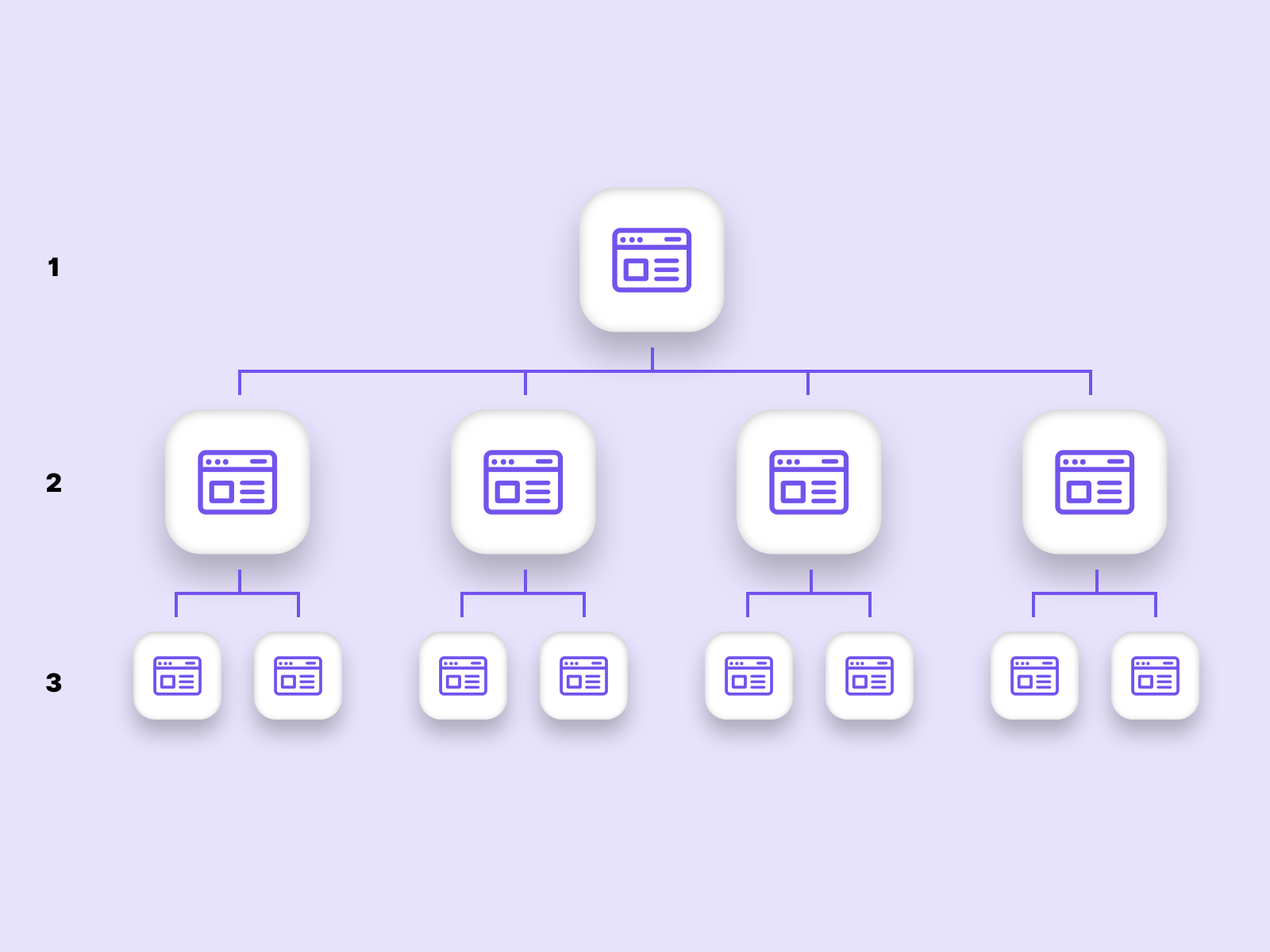
The site architecture should be displayed in the navigation, as shown in this example.
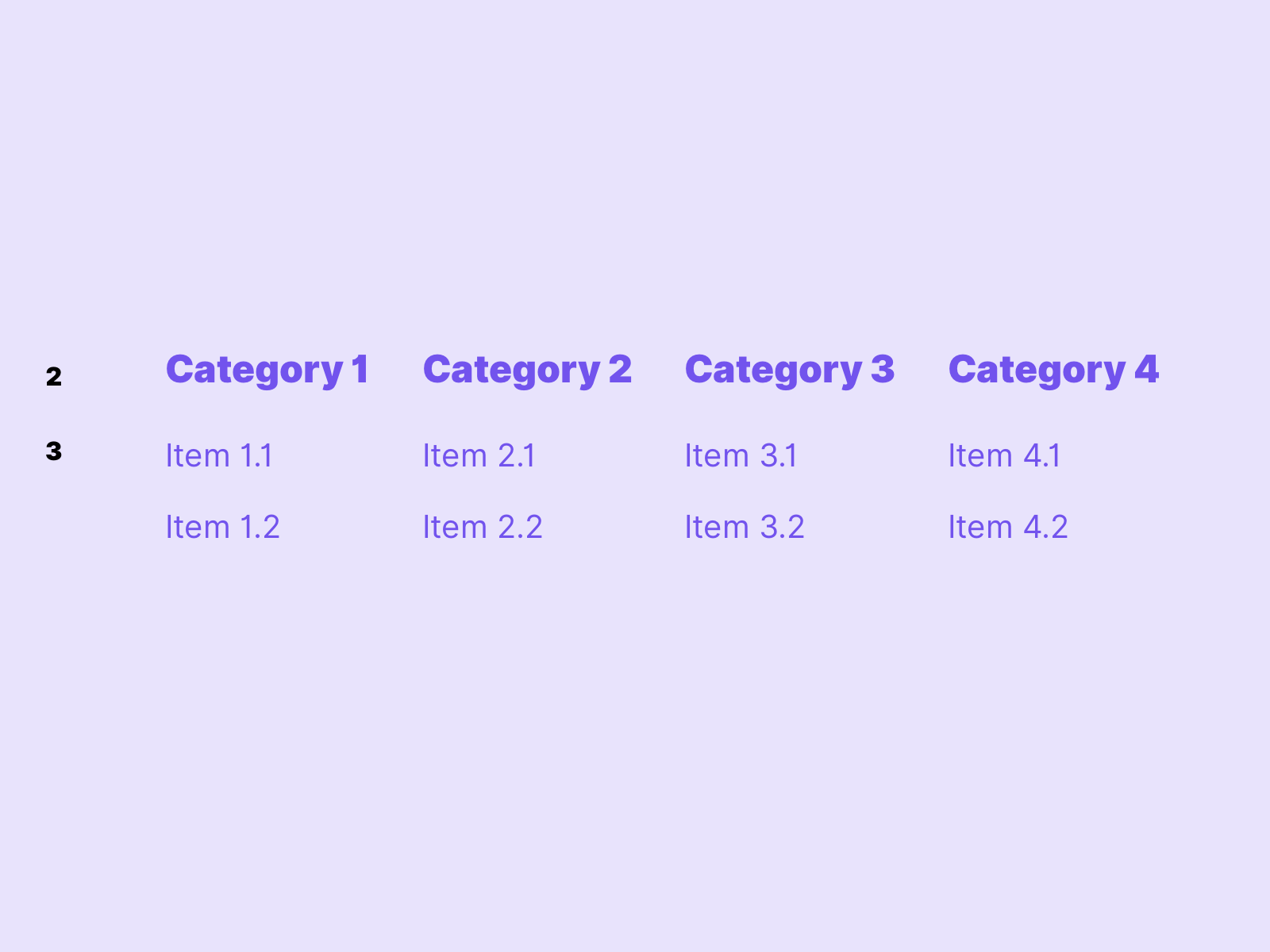
Where am I
Show the user in the navigation where he is on the page. By marking the active menu items, the orientation on the page is noticeably improved for users.
 In this example the active menu item is marked.
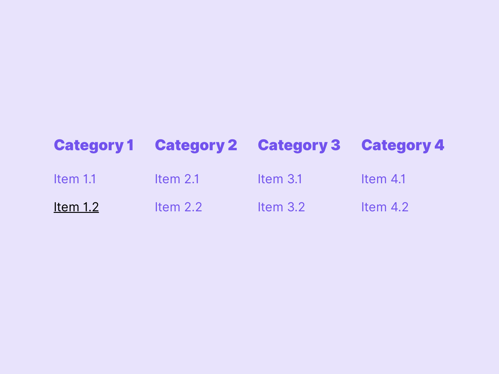
Where do I come from
But not only the active page should be highlighted, also higher-level pages in the navigation should be highlighted. In this way, the user is always aware of where he or she has come from and where he or she is currently located.
 In this example the active menu items are marked. This is applied consistently on all levels within the navigation. The user has a clear overview of where he is.
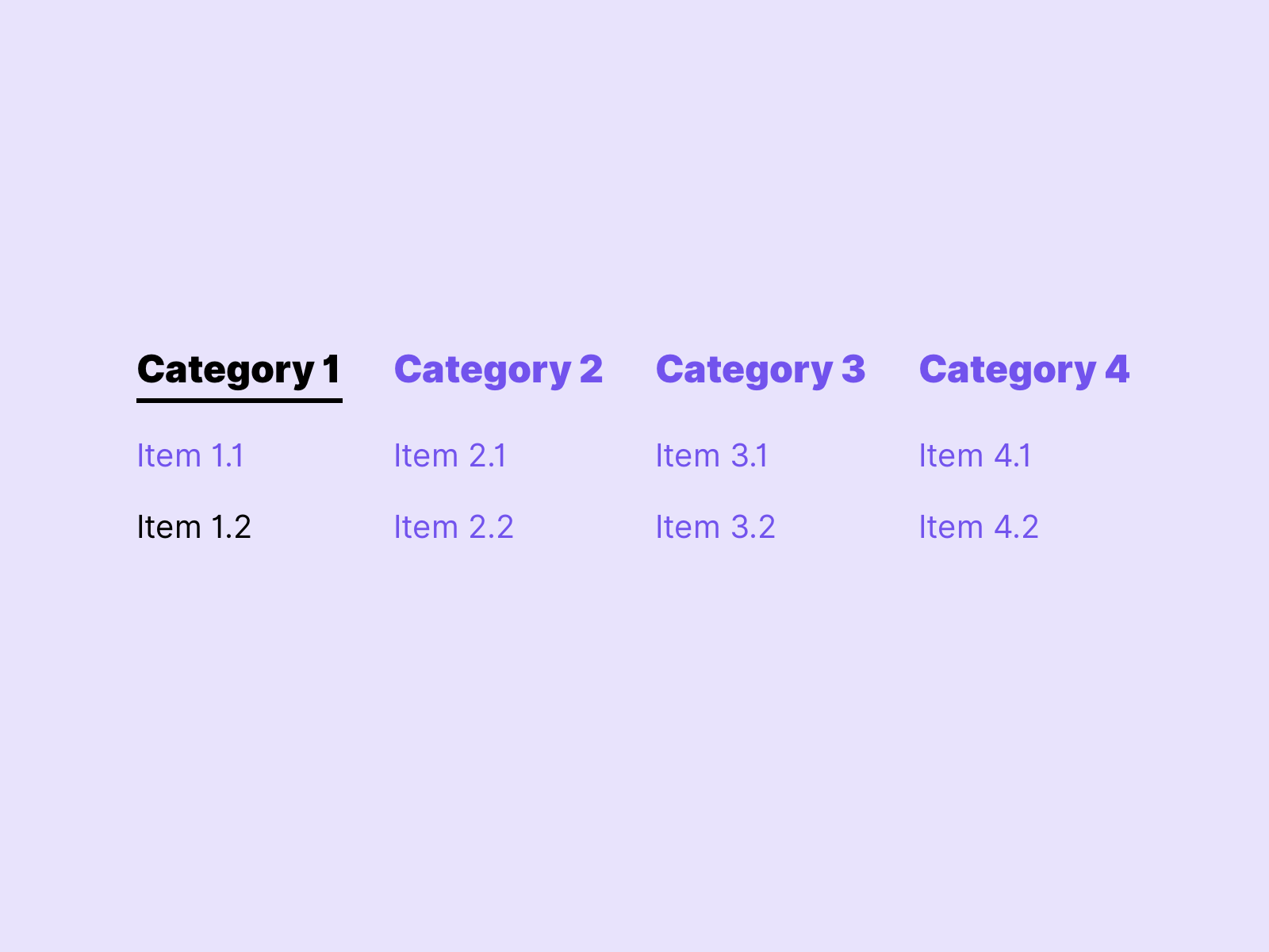
Where do I want to go
Highlight navigation points that are in the focus of the user. This helps users navigate through the page to find their way around.
In this example from Google Material Design we see how the hover state is clearly indicated in the navigation.
Often designers forget that the focus can also be designed. This is important for people who navigate the website with the keyboard. For better orientation of the user, the focus status differs in the visuality from the active menu items and hover. See keyboard friendly.
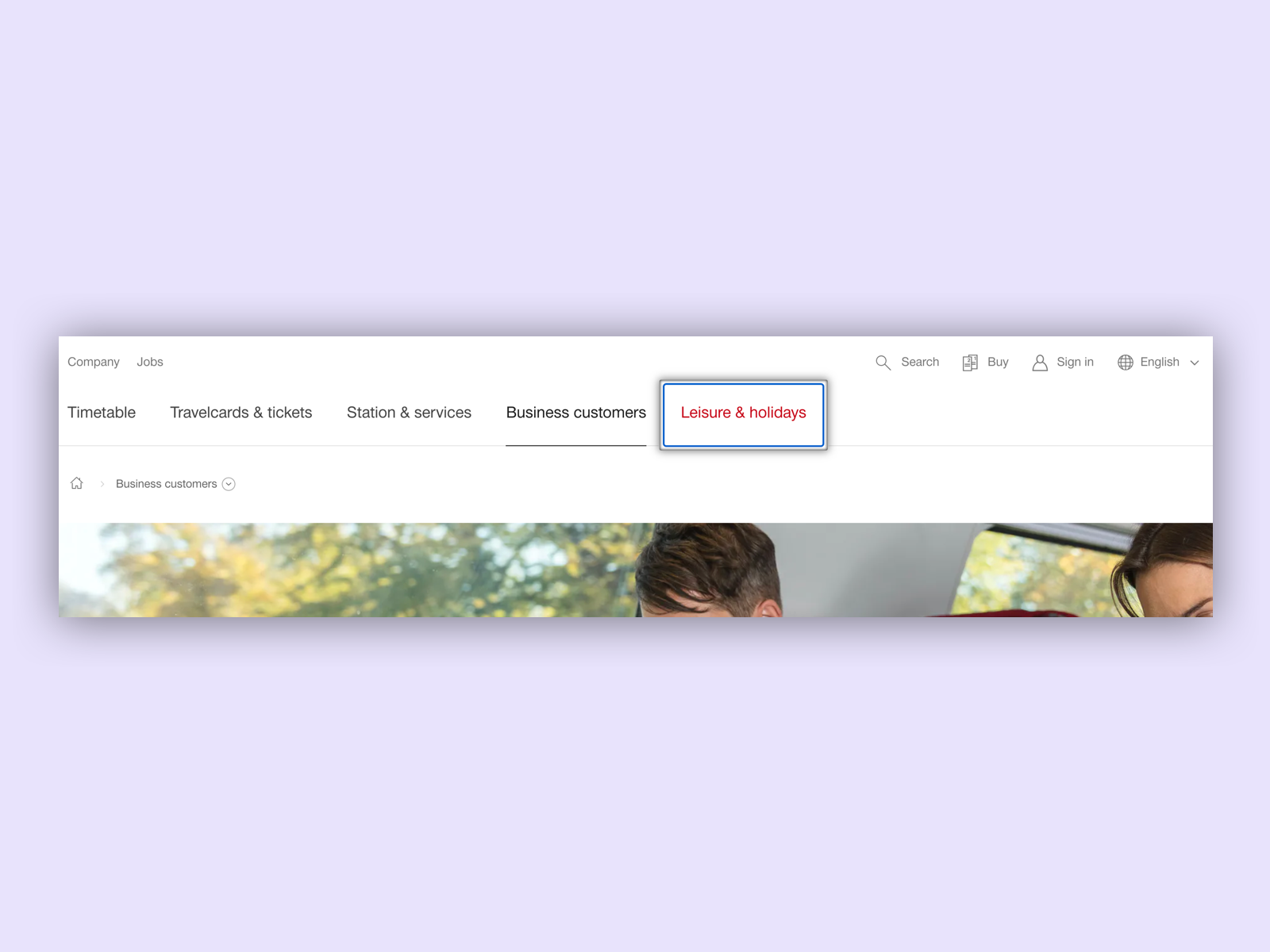 On sbb.ch the focus state has been specially marked with a shadow, which clearly distinguishes it from the active menu items (Business customers) and the hover status.
Breadcrumbs
In addition to navigation, breadcrumbs are excellent for showing the way of a user. Many designers tend to remove breadcrumbs for aesthetic reasons. I have a clear opinion on this and think this is a mistake. For complex websites with several navigation levels, they can make navigation a lot easier.
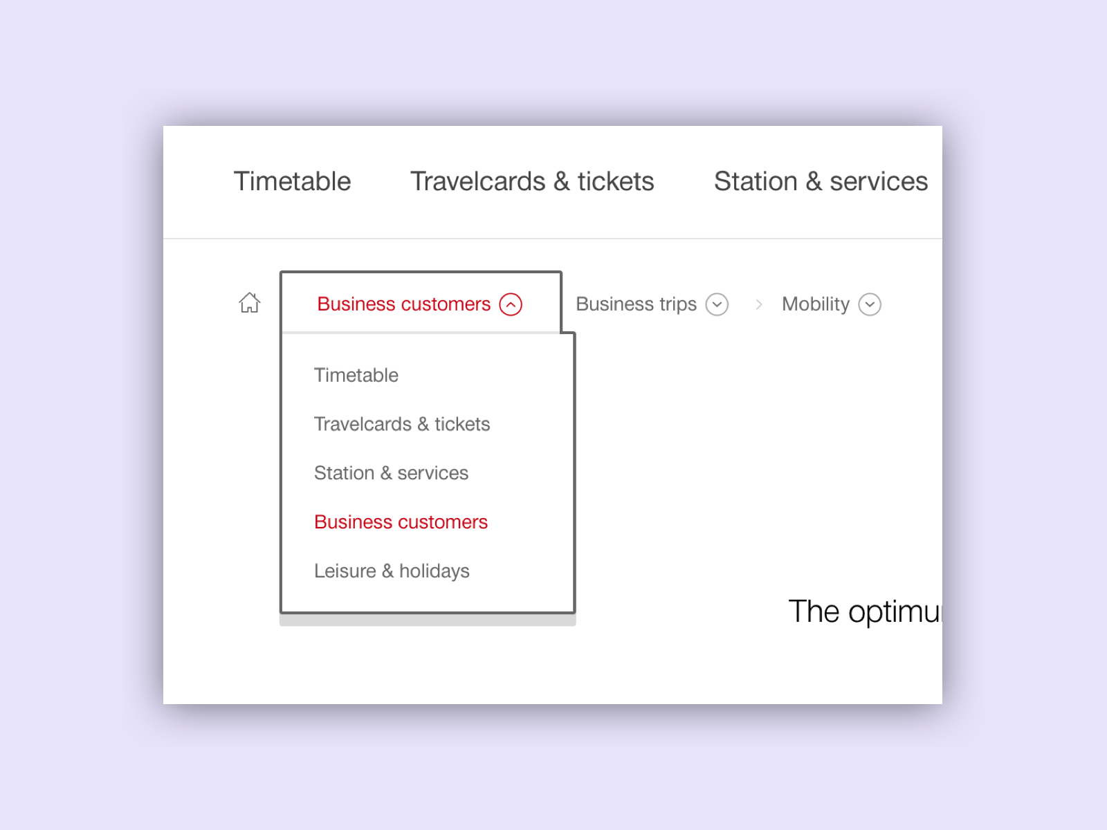 On sbb.ch the breadcrumbs were extended with a kind of menu function. This makes the breadcrumbs especially useful for quickly switching between the subpages of a topic using the keyboard.
Consistency
UI components with the same function should always have the same appearance. Therefore, the navigation within the entire page should have the same visual appearance and language. It can happen that a page has visually different sections, but the navigation should not be affected by this.
Footer navigation
Footer navigation is suitable for making pages accessible in various ways. The footer navigation should give the user an overview of the most important menu items. Useful links such as “Contact” and “Language selection” are quickly accessible.
Benefits of footer navigation
Not only important tasks can be reached via Footer naviation. The footer navigation also creates the visual end of a page. The repetition pattern at the end of a page gives users with disabilities an additional indication.
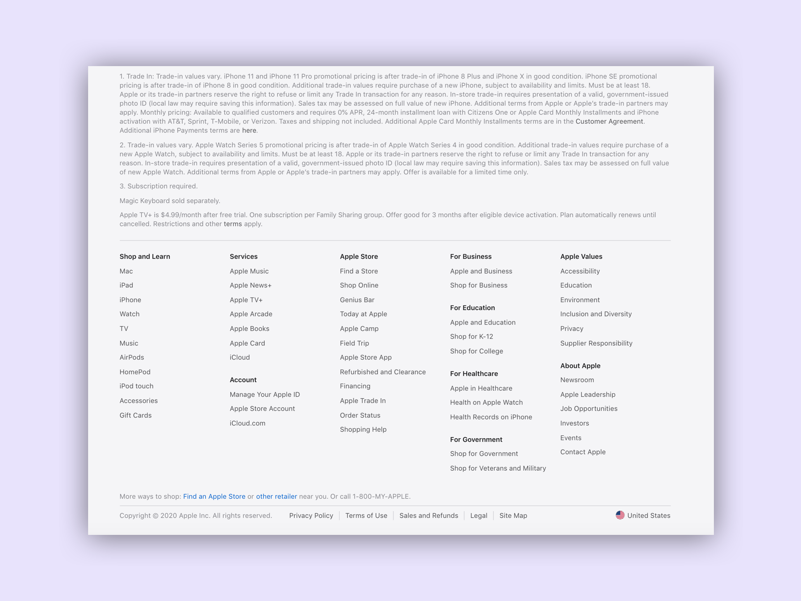 Apple lists the navigation again in the footer and also includes general settings and contact links there. Apple
Links
W3C – Bypass Blocks
W3C – Page Titled
W3C – Section Headings
W3C – Link Purpose
W3C – Multiple Ways
W3C – Focus Visible
W3C – Location